Encyclopedias & Fear of Density
Exploring the Legacy of Illustrated Encyclopedias: Can We Translate Their Dense Format into the Digital Realm?

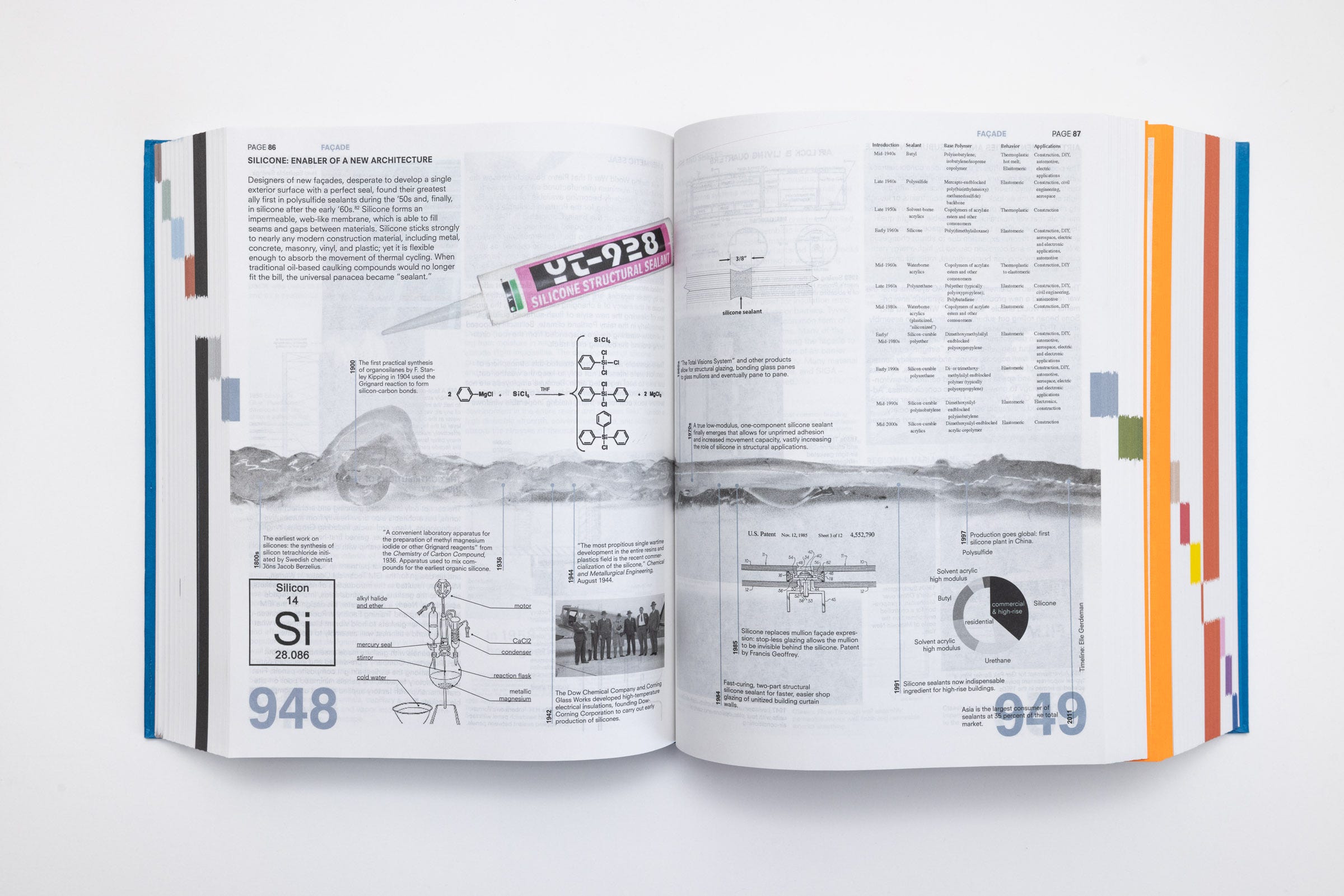
As a kid, my parents always got me these vibrant illustrated encyclopedias. I had one on plants, one on animals, one on space and science, and basically, one for any topic you could think of. Some were meant for kids, and others were more grown-up. Now that I think about it, I probably owned more encyclopedias than regular storybooks. My parents had a massive book collection, but that was more their thing. Me? I had a whole shelf dedicated just to encyclopedias. I can't recall the exact titles or who published them, but the illustrations were similar to the ones I found published by DK books below. Mine weren't as 3D-ish, but you get the idea.
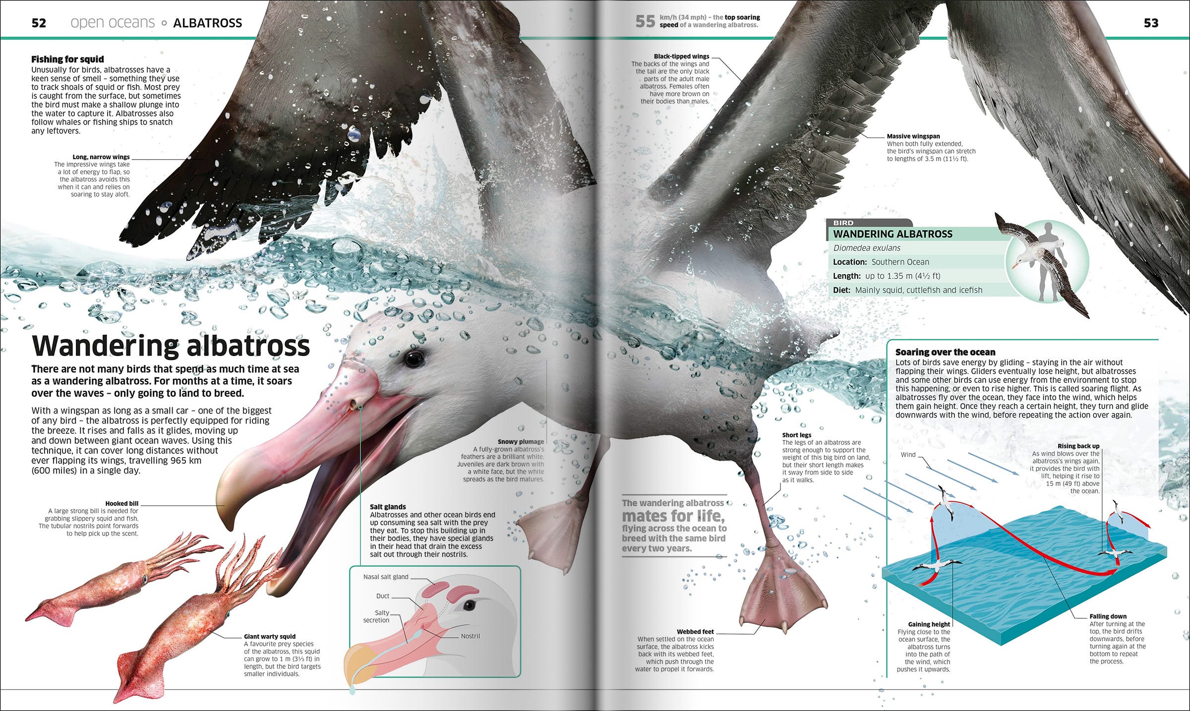
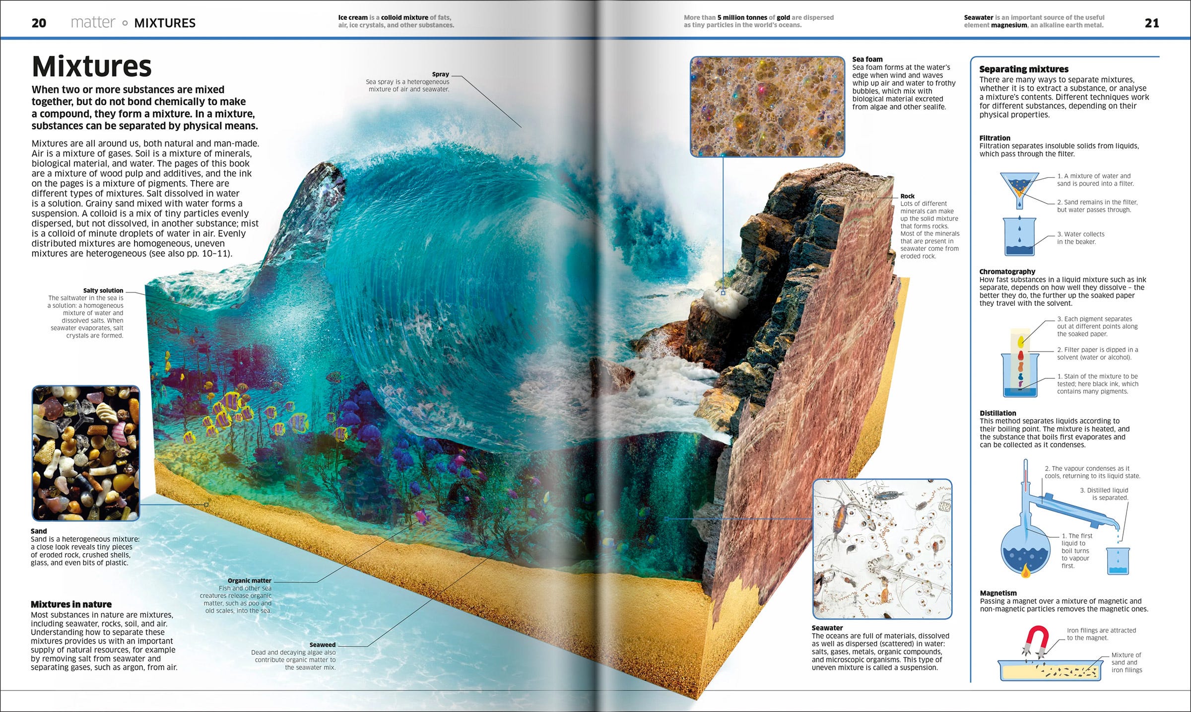
While regular books tended to be one-time reads for me – once I got the story, that was it – encyclopedias held a different allure. I found myself picking them up regularly, flipping to a random page, and getting lost for hours. Another weakness of mine was illustrated atlases. Now that I reflect on it, it feels like my first encounter with graphic design, even though I didn't really know what graphic design was back then. The way information was laid out and presented felt utterly captivating and almost magical.
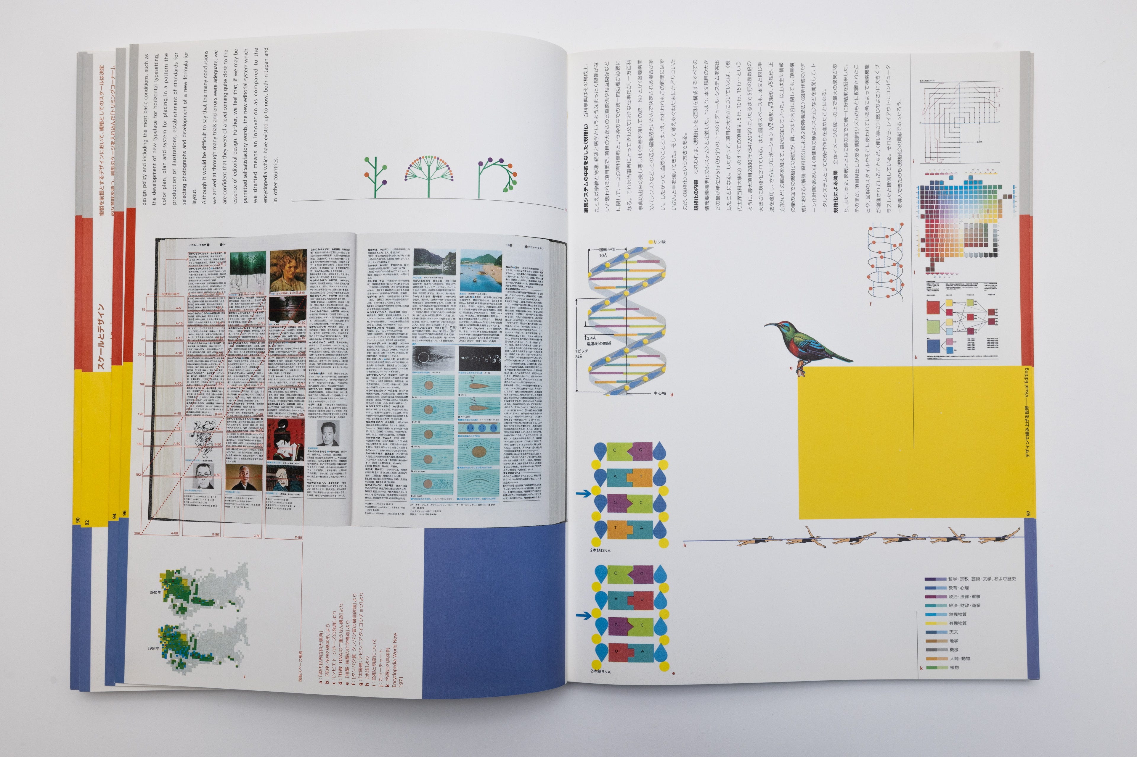
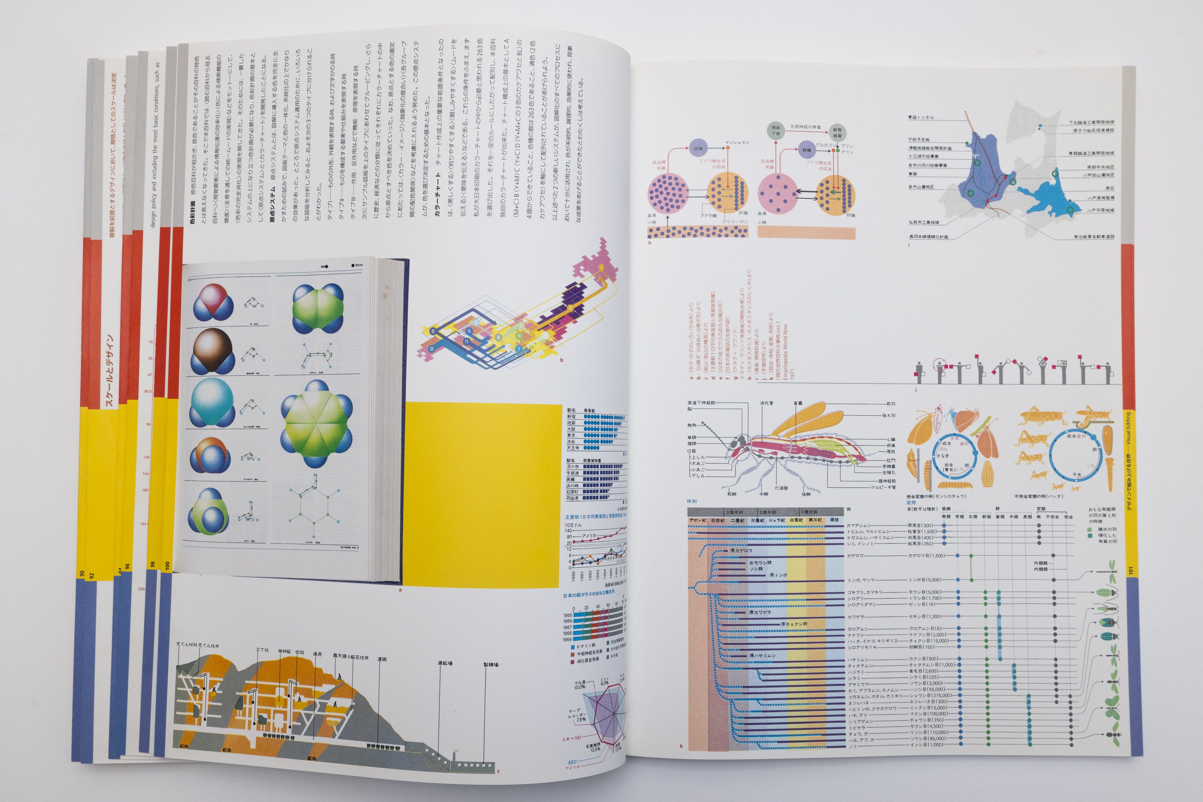
At this point, I'd like to clarify the distinction between "infographics" and the showcased encyclopedia spreads. In simple terms, infographics are about visualizing data – taking the numbers from a spreadsheet and representing them through charts, graphs, or on a timeline or map. It's about making the data visually accessible. The examples and layouts I'm talking about, on the other hand, are more about visualizing/illustrating content. The visuals and text are intricately woven together and laid out perfectly to make sense. You can't just swap an image and hope for the best (like in 99% of layouts), and you can't just throw in an extra paragraph or two expecting the text to spill onto the next page. These are custom-made to work seamlessly just once. The designer could have easily dumped all the text on one page and all the images on another, and it might have somewhat worked, but it wouldn't have the same impact.
In many ways, I believe it's dying format of delivering information. I have a few theories about why this might be the case (although I could be mistaken). Firstly, these layouts are challenging to execute. They demand a unique skill set to effectively organize information in this manner. Secondly, when books undergo translation into other languages, the intricate balance of visuals and text often crumbles. We encountered this issue ourselves when working on our book, which originally was designed for English version and later published in Japanese. Lastly, there's a prevailing inclination towards simplicity, favoring an uncluttered approach and a general aversion to density. When was the last time you presented a client with a densely packed information layout and received an immediate approval? Don't get me wrong—I'm all for simplicity. However, the notion that everything we do should always be simple strikes me as peculiar. The information that wasn't considered dense by people a century ago now seems unbearable today.
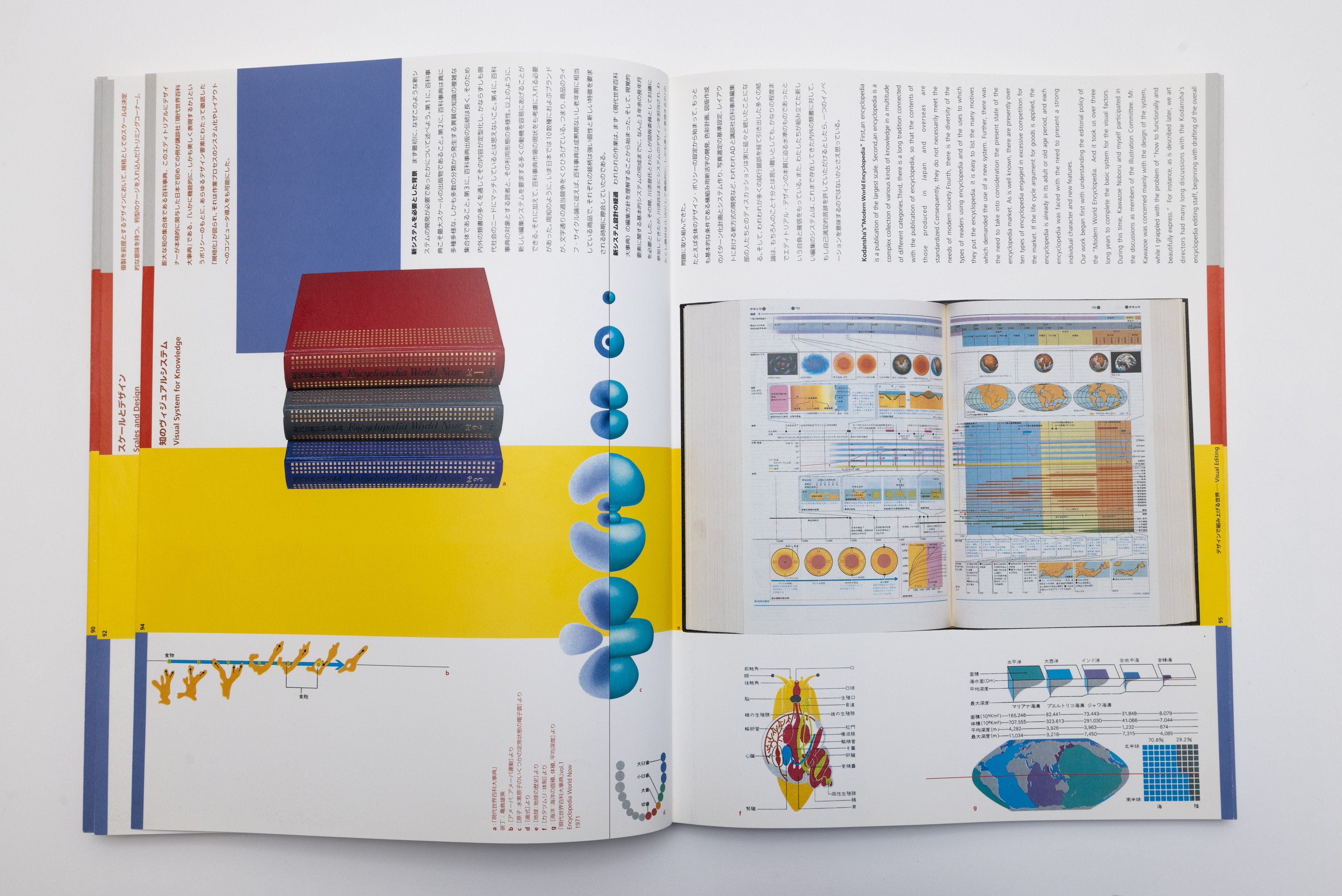
One of my all-time favorite designers, Mitsuo Katsui (1931-2019), left an indelible mark not only through his impressive graphic designs for clients like Issey Miyake but also through his work on encyclopedias. Among his grand undertakings was a six-year international collaboration with 20 designers on the Kodansha Encyclopedia—a massive English-language volume encompassing a broad spectrum of Japanese topics. What captivates me the most is that his own retrospective book, "Visionary Zone: Mitsuo Katsui" (published in 2004), is intentionally crafted to resemble an encyclopedia, complete with layouts featuring dense visuals. I find myself reaching for this book from my shelf ten times more often than any other.
Take a look at this Apple Macintosh print ad from 1984. Notice the striking resemblance in layout to the examples found in the encyclopedias above, where images are meticulously intertwined with text to convey Mac's features. The moment I stumbled upon this last week, I found myself dedicating a good 10 minutes to scrutinizing its details.
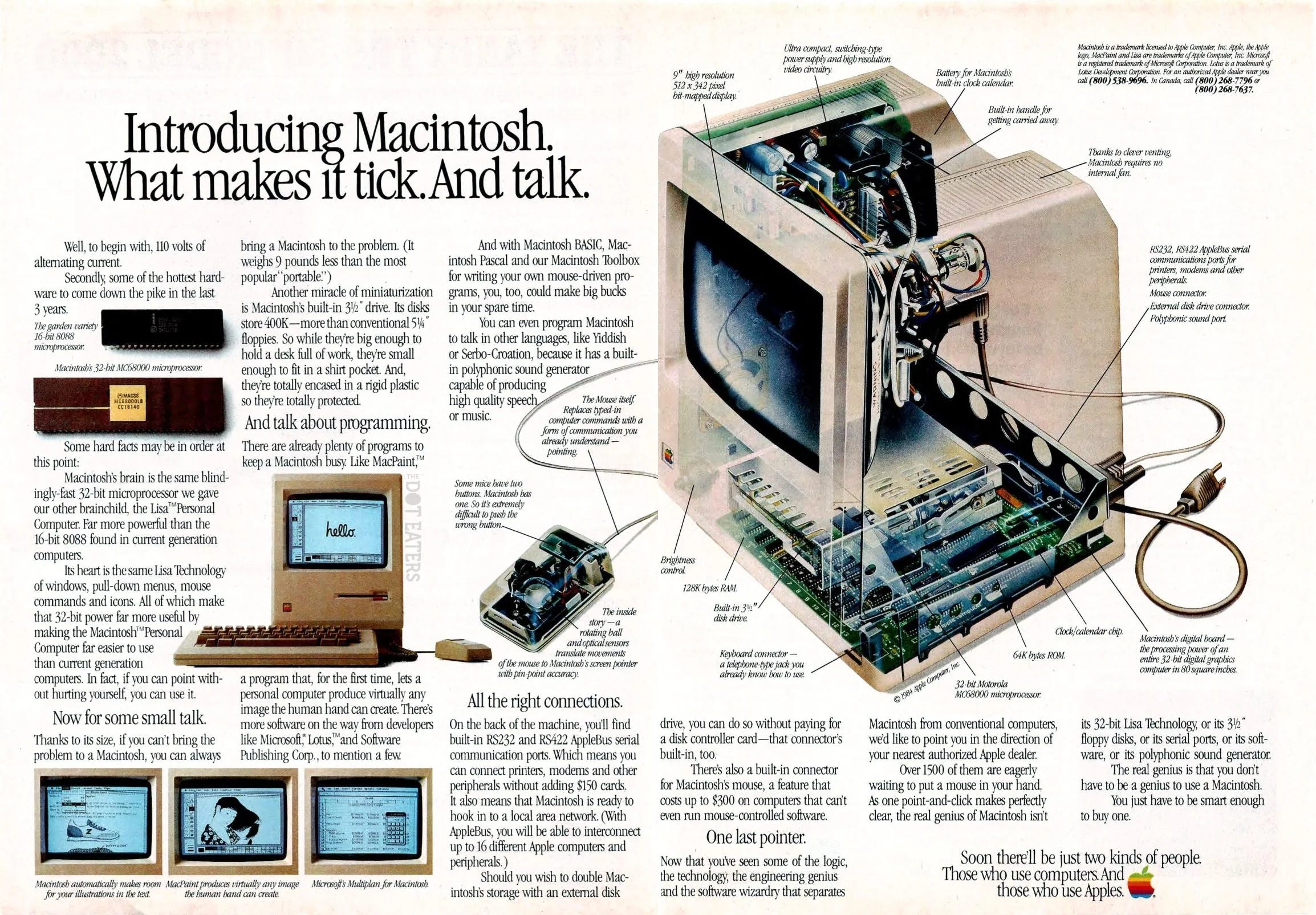
Today, when Apple wants to highlight a set of features in a static, non-interactive environment, they turn to what designers are currently raving about—the "bento box." The crucial difference lies in the increased dynamism of the "bento box," facilitating easy interchangeability of images and text to exhibit features for different products, a strategy actively employed by Apple. Yet, the core idea of introducing a semi-custom layout with dense information gained significant popularity within the design community.
Of course, this type of layout isn't groundbreaking. For those old enough to recall, there was a Sprint website back in 2008 that showcased the "bento box" layout, which, of course, now appears outdated by today's standards.

Regardless of how the Sprint website appeared in 2008, I appreciate the effort. That allows us to smoothly transition into the digital space, which occupies much of my focus.
The "visual encyclopedia" style layouts never quite transitioned into the interactive medium. There were scattered examples, particularly in the realm of “long-reads”, which appear to be another fading format. During the initial introduction of the iPad, there were hopeful expectations for a new era of "digital publishing," prompting some of the earliest magazines to invest time in making their high-density layouts interactive. Another notable example that comes to mind is the demo titled "A Next-Generation Digital Book" by Mike Matas, showcasing an interactive version of Al Gore's book "Our Choice." However, any further attempts seemed to stall at that point.
There are evident technical constraints that hinder the creation of layouts like these. When the iPhone debuted in 2007, the web began its shift toward "responsiveness." Designing such layouts is challenging from the outset, and introducing breakpoints and mobile versions exponentially complicates the task, demanding a substantial amount of time. Not impossible, but hard and expensive. Developing a front-end is no walk in the park either. Ensuring everything renders smoothly across various browsers, given the stubbornness of developers who can't agree on operational standards, is a time-consuming (and costly) endeavor. Additionally, those conducting user testing groups would often return with feedback that users found such layouts confusing and “hard to digest”. I am not suggesting that everything should adopt an encyclopedia-style, but out of the billions of digital experiences launched in the past five years, was there no room for it anywhere? I doubt it. We are afraid of complexity.
Moreover, crafting something like this necessitates having the content thoroughly prepared before the designer initiates the process. When was the last time that actually occurred? Presently, there's a widespread expectation that anything digital can be constructed in a modular and flexible manner, allowing the incorporation of any content at any time. This, in my view, is the primary reason behind the prevalence of "basic" and "templated" solutions seen across the spectrum.
Lastly, I believe the widespread accessibility to video content these days has its own influence. I actually think that this entire story would have performed 100 times better if it was a video on TikTok.
Nevertheless I keep trying to at least take some inspiration from that forgotten medium. During our collaboration with M+, a newly established museum of contemporary Asian visual culture that opened in Hong Kong right after the pandemic, there was a noteworthy attempt on my side. Within the myriad sections and pages of the website we designed for user-friendliness, there was one section dedicated to the actual building of the M+ museum, designed by star architects Herzog & de Meuron. It felt like the right place for such a visual layout.
We received a cross-section schematic of the museum directly from engineers, which took me some time to simplify and make usable. This technical drawing offers a sense of the museum's size—a significant 11-story building on the waterfront of Hong Kong, that we wanted to convey to the users. Its technical appearance also aligns with the content on this page: interviews with architects, insights into design and construction challenges, and more. From a layout perspective, the cross-section plan sits in the middle of the page, surrounded by six call-to-action buttons that open overlays with additional information. It took a lot of effort to figure everything out, but in the end, this entire layout works seamlessly on mobile, supports three languages (English and both Simplified and Traditional Chinese) and the content is driven by the CMS (content managements system). While comparing it to the examples from the beginning of this story is painful, considering all the constraints, it is at least an attempt.
In December, I made the decision to update my personal website, repponen.com, which, in contrast to client work showcased on Anton & Irene, serves as my personal "encyclopedia" of visual experiments. There, you'll find an array of projects—some realized and launched, while others remain at the conceptual stage. Serving as an almanac of my design obsessions, the content spans across design, architecture, photography, furniture and contemplations on the abstract concept of time.
Built on the Cargo platform, the website faces its own array of limitations. However, it was more manageable to maintain everything there than to build a custom website from scratch. When contemplating the home page design, my initial idea was to have a full-screen image gallery flicking through featured projects, a solution seen countless times. Instead, I opted for a dense, somewhat chaotic, encyclopedia-type layout to communicate my background. As mentioned, the platform I use has limitations in terms of assembling such a layout. Notably, I lack the ability to control a different number of columns on desktop and mobile for the same page. Consequently, the current layout isn't really mobile-friendly. I launched the site and kind of forgot about it.
Despite these limitations, to my surprise, the website gained significant traction and was widely shared, notably on SiteInspire. I frequently come across screenshots of this homepage in various tools that people use to collect inspiration. This surprises me because I often hear people express a preference for the opposite—clean, uncluttered, easy-to-digest layouts. This layout is none of that.

The essence of this narrative, I suppose, is to encourage embracing visual complexity when it is fitting. If anyone reading this has good examples from the digital space, please send either a screenshot or a link to repponen@gmail.com. I am actively collecting such material. Additionally, if you enjoy this story, I would be grateful if you could share it.
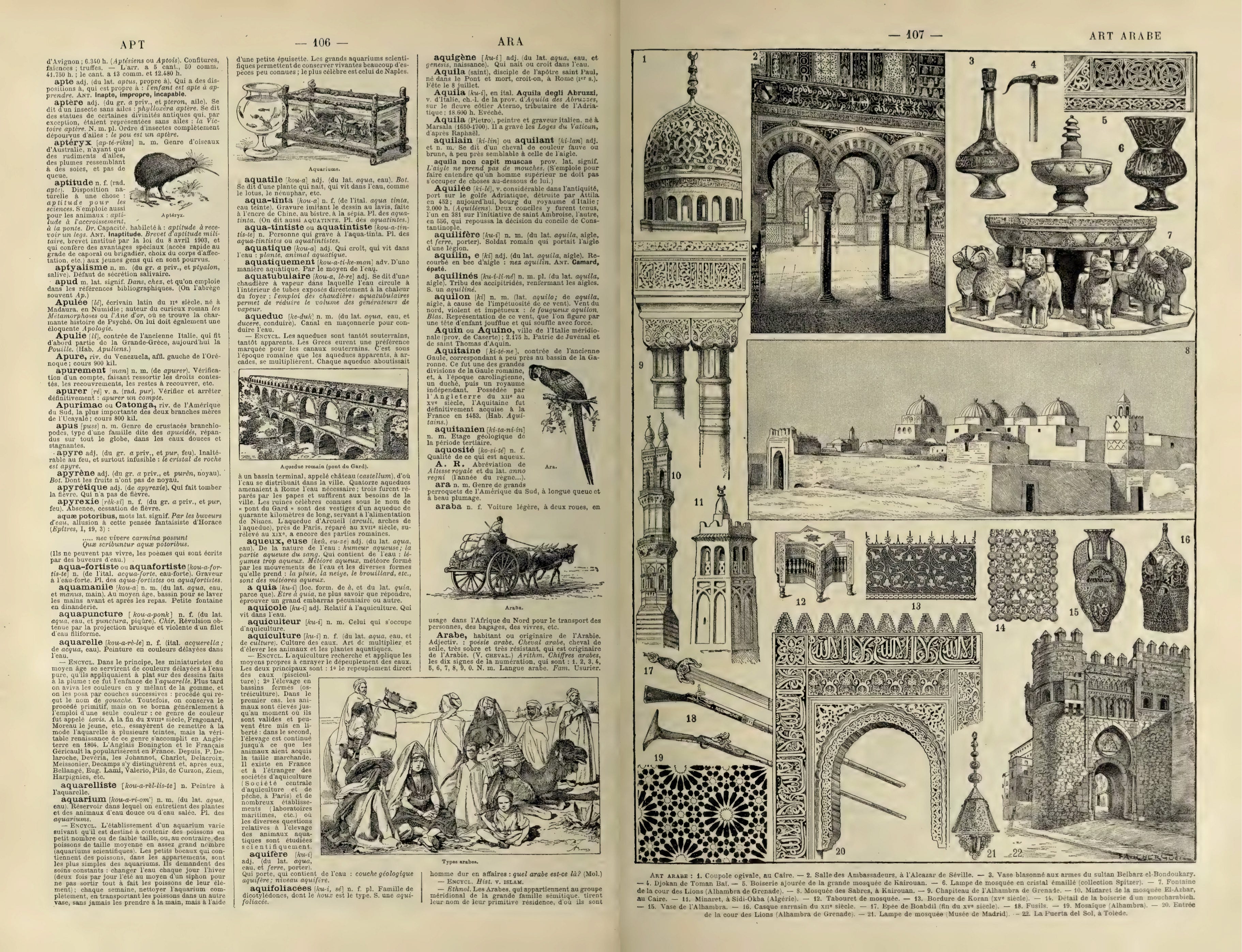
Meanwhile, I find myself appreciating these types of layouts in print, particularly in the 2528-page "Elements of Architecture" by Rem Koolhaas, brilliantly designed by Irma Boom. Much like in my childhood, I frequently revisit this book, marveling at its contents.