Expand Your Design Vocabulary
If the only tool you have is a hammer, you will start treating all your problems like a nail.
I often think of design tools and skills as a "vocabulary." The more diverse and expansive your vocabulary, the more versatile and effective you become as a designer.
Options and Solutions
Before we dive deeper, I want to clarify something: as you likely already know, there is no single "right" solution to a design problem. Design is fundamentally about exploring multiple options and selecting the one that works best under the given circumstances. For example, could I create the most beautiful and user-friendly solution, even if it costs a billion dollars? Probably. But would that be the optimal solution for a product with a budget one hundred times smaller? Definitely not. Similarly, could I design the simplest checkout flow even if the client’s outdated backend can’t support it? Yes, and I’ve done so many times. But is that the best solution when the organization doesn’t have the resources to overhaul its tech infrastructure? Likely not. In an ideal world, we’d change everything necessary to achieve the perfect design, but reality is often at odds with what we want.
A key responsibility of a designer is to explore multiple solutions to a problem and then choose the most optimal one. However, to do that effectively, a designer must first truly explore a range of possibilities. While this may sound straightforward, many designers fall short. Too often, I see only a single solution presented—perhaps with a minor variation, like a button being centered versus left-aligned—followed by a desire to user test these as “options” to determine which performs better. While there’s nothing wrong with testing small adjustments, this isn’t the same as offering two or more distinct solutions. It’s simply one solution with a minor tweak.
The less experienced a designer is, the more options they need to explore—and naturally, this takes longer. That’s perfectly normal. As designers gain experience, they become quicker at evaluating options, often sorting through them mentally. This is because “experience” isn’t just a vague term; it’s a collection of solutions that designers have tested over the years, along with a deep understanding of what works and what doesn’t in different situations.
When you examine the work of an experienced designer, you'll often notice that they genuinely search for various solutions, experimenting with drastically different approaches. And here’s the interesting part: the best final result is rarely just one solution chosen from five. It’s typically an intricate blend of different ideas—something no designer could have arrived at without first exploring those multiple options.
Design Vocabulary
It doesn’t matter what problem you're solving—whether it's designing a checkout flow in your app, enabling users to filter products, visualizing information, or defining the look and feel of a project. As a designer, your responsibility is to explore a range of potential solutions.
As you expand your design vocabulary, your potential solutions broaden as well. For instance, imagine you’re working on the onboarding process of an app that needs to guide users in pairing a hardware device with their smartphone. You could rely on the most basic design tools at your disposal—typography, text, composition, and layout. But could the same information be conveyed using photography? Perhaps a video could walk the user through each step, one by one. What if 3D elements were incorporated? Maybe strong copywriting combined with motion design could solve the problem. Could sound add value to the solution? Or perhaps a well-designed pictogram or schematic is the most effective approach. My point is, tools are just one aspect of expanding your design options.
I know designers who can envision all these potential solutions without ever having worked with those disciplines. I envy them because I’m not like that. I need to spend time learning new tools—or at least gaining a basic understanding of how they work—before I can add them to my “design vocabulary.” Then, the next time I face a design problem, I can mentally sift through those tools, picking them one by one to see if the solution lies within.
Pick up photography, and once you understand how to capture a great photo that tells a story, you’ll have added a valuable skill to your design vocabulary. Learn 3D, and you’ll find moments where it becomes the most optimal and user-friendly solution. Explore motion design, and you’ll realize that some concepts can be communicated far more effectively through motion than with text or icons alone.
You don’t need to excel at everything—you just need to be aware of the options, understand how they can be applied, and be proficient enough to create a first draft or prototype. After that, you can hire specialists in video, 3D, motion, sound, and other areas to deliver the final high-quality result. Or, if you prefer, you could handle it yourself. But if you don’t explore these possibilities, your solutions will always look the same, and you’ll never know if they’re truly the best because you haven’t tried anything different. As the saying goes, if the only tool you have is a hammer, every problem starts to look like a nail.
Whether you present all these options to your team or to a client depends on your process—that’s up to you. But first and foremost, this exploration is something you, as a designer, do for yourself.
Personal Journeys
The fact that there are multiple right answers to the same problem is, for many, an intimidating part of design—but for me, it’s what makes it beautiful. After 20+ years of experience, I still get excited each time I’m faced with a visual problem to solve. As soon as I identify the problem, I immediately envision 20 potential solutions. About half of them won’t work—whether due to inefficiency, cost, or limitations—while others might be too complex. But there are always 3 or 4 that could be the most effective. And once I start visualizing them, they inspire me to create another idea I hadn’t thought of at first. This is my process, and it’s what makes design so thrilling.
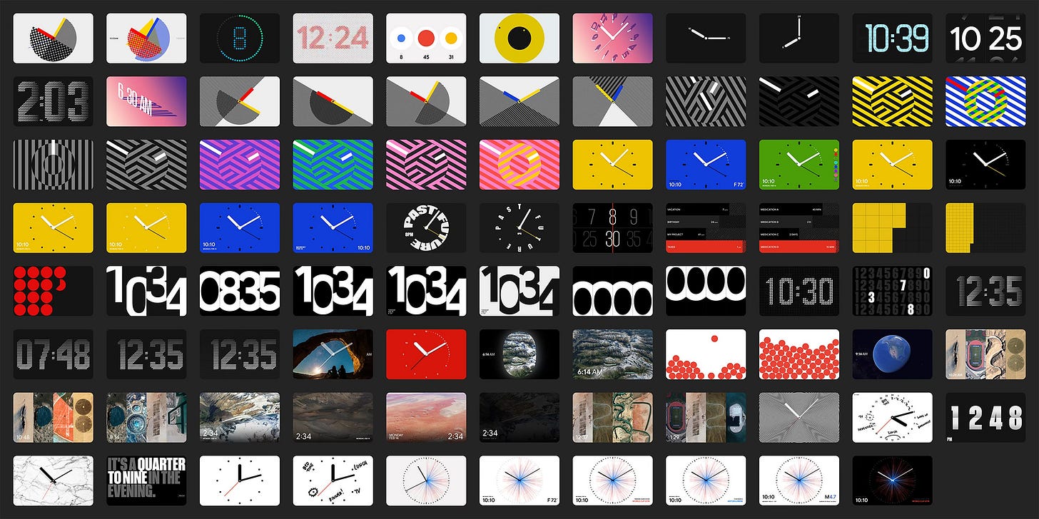
A few years ago, Google approached us with an exciting challenge: how to visualize time on their new device, the Google Nest Hub—a smart speaker with a tablet-like screen. When the device is in standby mode, it needed to display the current time. But how should that look? Sure, there are traditional ways to show time, like digital numbers or clock hands, but we wanted to explore beyond the conventional. What else could time look like?
During the concept phase, we developed 38 completely unique watch faces, each using different metaphors and tools to represent time (digits, typography, 3D, photography, abstract motion, infographics, even Google Maps …). Of course, not all of them were shown to Google—it would’ve been overwhelming to present so many options. Instead, we curated a selection, with less than a third making it into the presentation. From those, Google chose five designs to develop further and prototype, and eventually, four of them were built and launched with the new device. You can read about it more in our case study.
Here’s another example from just last year. In the fall of 2023, I decided to explore Spline, a tool that enables 3D directly in the browser, to see if it was something I could incorporate into my design process. But when I’m learning a new tool, I always need a project to focus on—it helps me dive in. So, I started looking for inspiration and tutorials.
Just a few days earlier, I’d stumbled upon a small, Japanese-owned shop in Brooklyn that occasionally sells used Japanese books and magazines. There, I discovered a secondhand copy of New Engineering by Yuichi Yokoyama, an experimental Japanese manga artist. Without hesitation, I bought it, and it ended up becoming the spark for my project. The idea came to me: what if I created an abstract 3D comic in the browser? That’s when the concept of an obscure hotel took shape, where each frame of the comic is a 3D room, and the main character moves from room to room, searching for a way out.
Over the course of several evenings, I slowly built out the scene in Spline, crafting different rooms, modeling, and rigging a character to bring the story to life. As with any new tool, much of the time was spent watching tutorial videos on Cinema and Spline, figuring things out piece by piece. In the end, I created 11 unique rooms, arranged in a vertical layout reminiscent of comic book frames, where users can scroll up or down to explore the entire hotel.


The result? Surprisingly interesting. You can check it out here. Did I master Spline in the process? Not exactly. But I gained enough understanding to see how it could be useful in the future. Ultimately, it was just an experiment—a way to test new ideas and explore the possibilities.
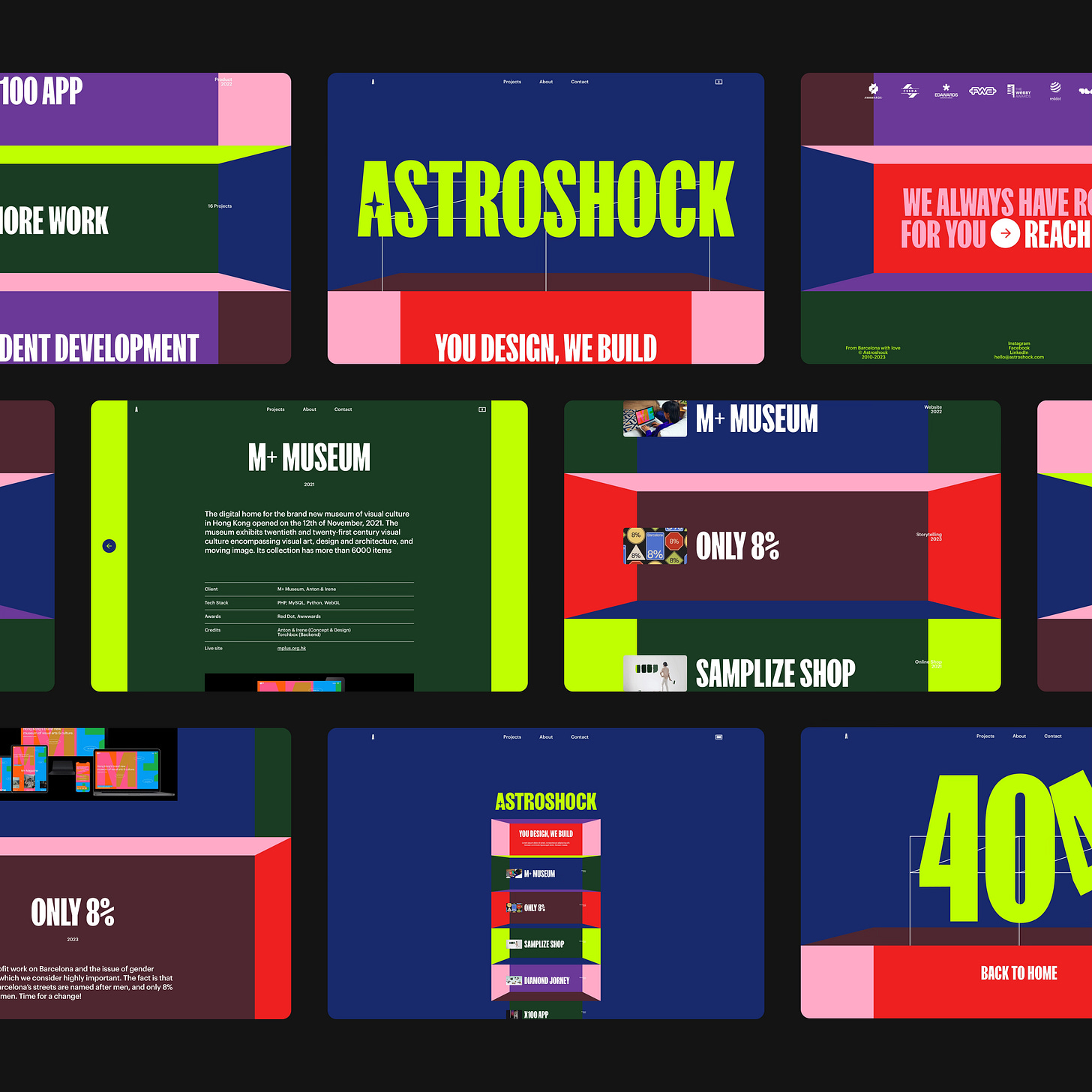
A couple of months later, I was working on a portfolio redesign for our development partner, Astroshock. Their website was outdated and in desperate need of a complete visual overhaul to showcase their work in a fresh, unexpected way. I remember trying countless options, but nothing felt right. I started with traditional portfolio layouts—grids and lists of projects—but those would have made the company blend in with countless other sites. I even experimented with a design that mimicked a chatbot to highlight their focus on development, but it turned out to be too complicated. No matter what I tried, nothing clicked.
Then, it hit me—what if I adapted the concept from the Hotel project I had worked on earlier? The idea of scrolling through floors had something magical about it. Of course, it couldn’t be a one-to-one replication, but there was potential in applying that concept. A couple of hours later, I had a first draft and a quick prototype that immediately convinced everyone it was the right direction.
The final result wasn’t built in Spline, of course. Instead, we used custom code to create a 3D-like effect. It’s a simple concept with a big visual impact: each "floor" of the tower represents a project, stacking up to form a larger structure that showcases the company’s work. At the base of the tower is the company itself, with their About section forming the foundation. I never would have come up with this solution if I hadn’t first explored a new tool and discovered the possibilities it offered.
In design, there’s rarely just one right answer. The real value comes from exploring different possibilities, stepping outside the usual approaches, and experimenting with new tools. Expanding your design vocabulary gives you more options to consider and keeps your process interesting. Whether you're a seasoned designer or still learning, it’s the willingness to try different things—even if they don’t always work—that leads to better, more thoughtful outcomes.
Thank you for reading.
You can subscribe to this publication using buttons below as well as follow me on Instagram and Twitter.


Thank you for your text, which has opened my mind. I have recently encountered problems with inspiration. Thank you for your words and works.