

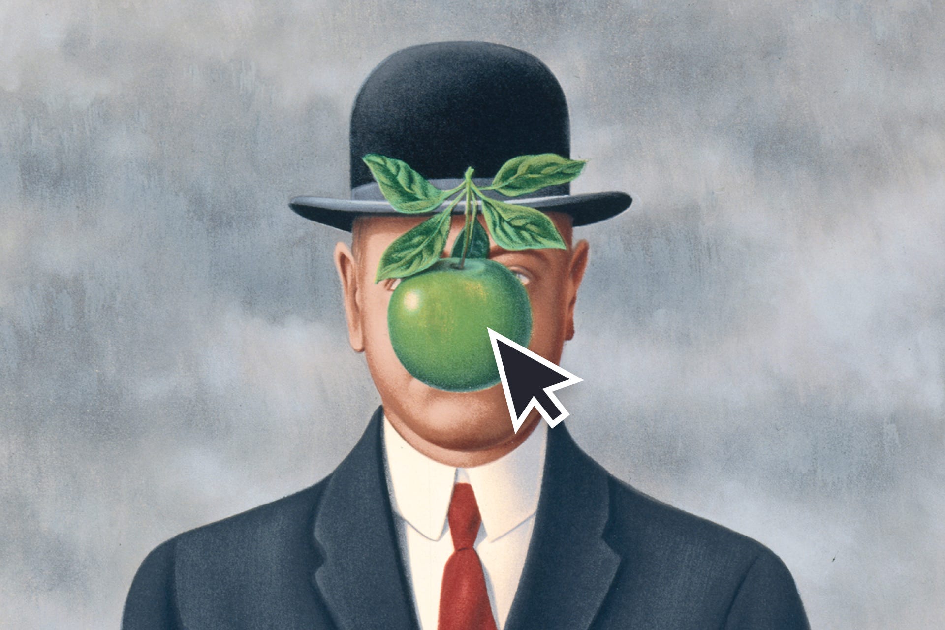
Think of a famous product or logo with a face in it.
Starbucks probably comes to mind first. Maybe KFC, Wendy’s, Chiquita bananas, Pringles or Ronald McDonald, even though some of these are technically mascots rather than primary logos. The first examples overwhelmingly have something to do with food.
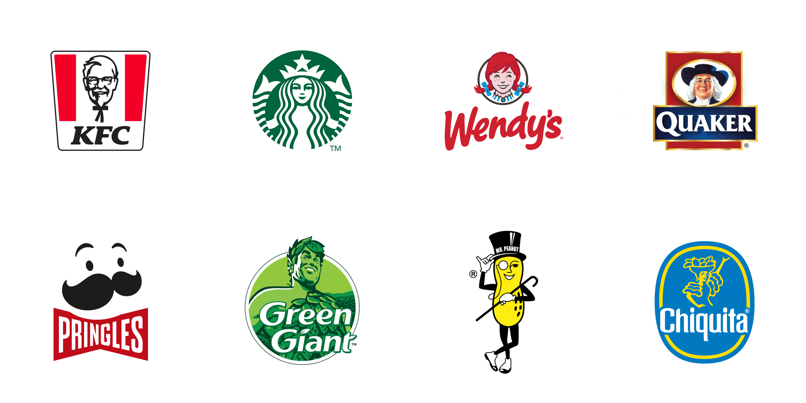
This is not surprising. Before food was produced on an industrial scale, packaged and distributed across millions of stores, it usually came from a person. You bought meat from a butcher, bread from a baker and vegetables from someone at a market, so the product had a human source. You saw the person who prepared it, selected it or handed it to you.
Mass production removed that human connection. Food was sealed inside branded packaging and placed on a shelf alongside countless competing products. A face on the packaging could restore some of that connection. It made it look as if a fictional character had made the product, prepared it or was now giving it to you. Colonel Sanders appears to have prepared the chicken. Wendy welcomes you into the restaurant. This fiction reconnects the product to a human being, even when no such connection exists.
This explanation is only an interpretation rather than a single proven theory explaining why food identities developed this way. But it aligns with what these faces do. They give industrial products authorship, familiarity and social presence. Some research on food packaging also shows that characters are not simply decorative. Studies, particularly those involving children, found that familiar brand mascots and characters can affect product preference, choice and even perceived taste. 1
Food gives us an easy place to begin because the faces are already familiar. The strange part starts when we leave the supermarket.
Major Faces
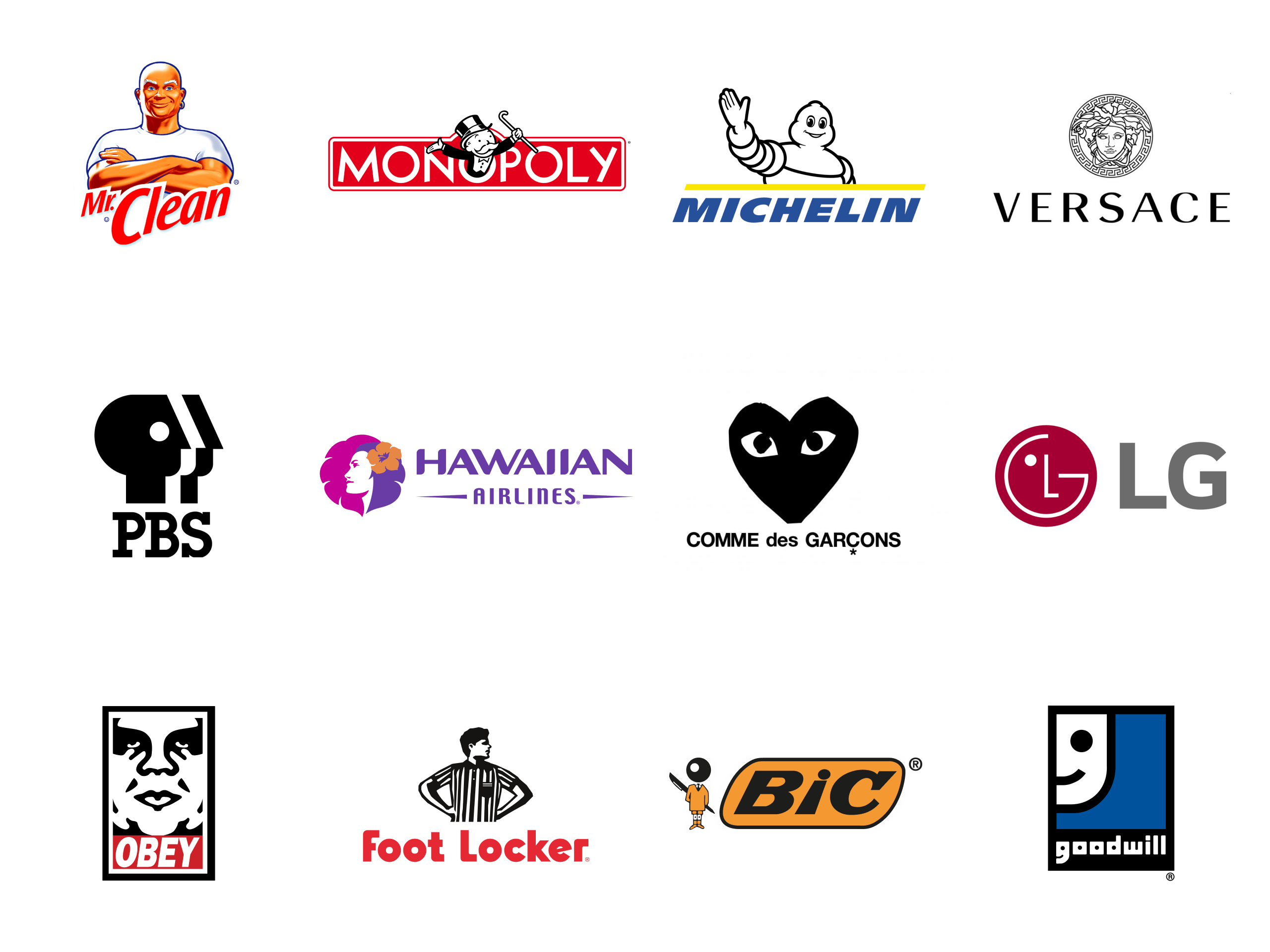
Now think of faces on products, but avoid the food industry. Which major brands use a human face or even the simplest face-like arrangement as their primary identity? When I try to think of examples, I see the Michelin man, the face of LG, the head of Medusa in Versace, the Hawaiian Airlines profile, the PBS heads and a few others, but after that, it becomes difficult to think of more.
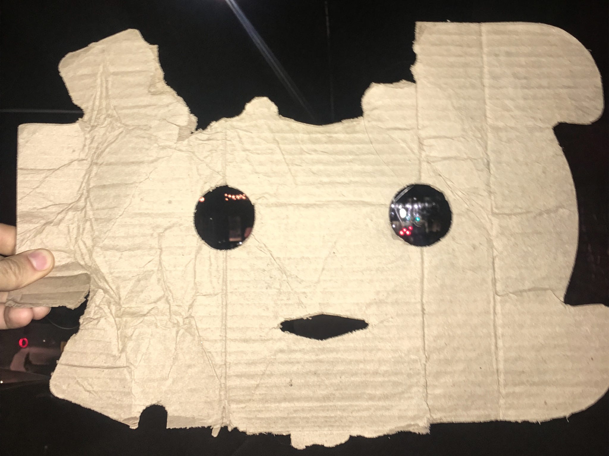
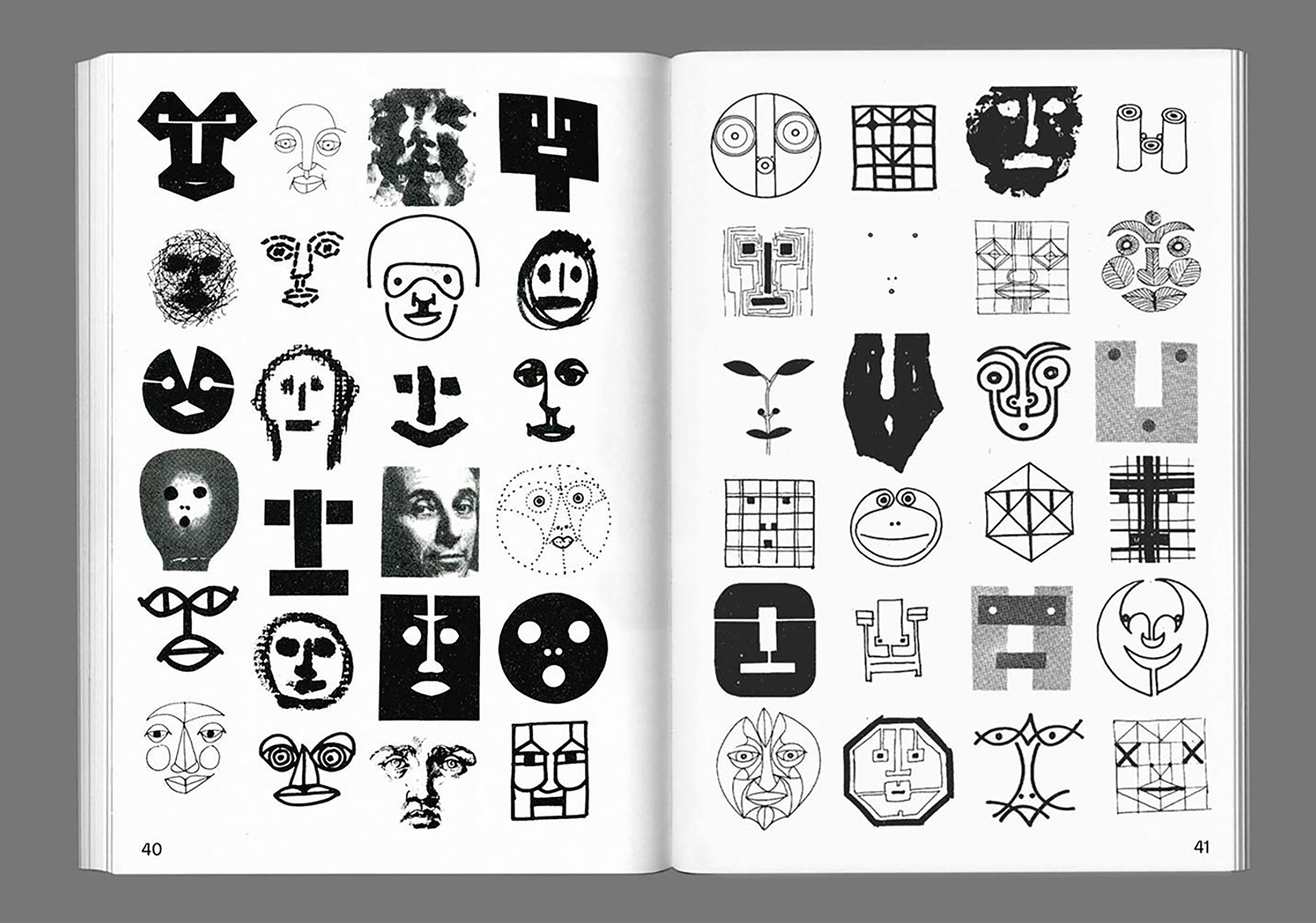
More importantly, I am not talking only about detailed illustrations in which we can recognize age, gender, identity and other specific features. I am interested in the minimum amount of visual information required for us to register a face. Two circles can become eyes, a simple curve can resemble a smile. Just a few marks placed inside an abstract shape can suddenly create the impression that someone is looking at us. Nothing needs to be anatomically correct, nor does it need to be human in a literal sense. It only needs to trigger the recognition of a face.
We do this all the time. We see faces in electrical outlets, building facades, cars, rocks and clouds. This phenomenon is generally called face pareidolia, and you can find whole communities online dedicated to finding these faces. But the question that I am interested in is why design uses this visual solution so rarely.
Look at identities of large corporations, banks, airlines, tech and pharma companies. You mostly encounter words, initials, circles, rectangles and every other kind of abstract shape. There are many symbols, but very few of them look back at you.
How many companies in the Fortune 500 use a face in their primary identity? I could only find two. Starbucks and Lincoln Financial, which uses the likeness of Abraham Lincoln in its logo. That is 0.4% of the largest companies in the United States. Unless we are willing to count Amazon, where a curved arrow pointing from “a” to “z” is occasionally described as a smile.
My point is once food is removed, any face-based or anthropomorphic identities become surprisingly difficult to name. This would make sense if faces were weak or ambiguous visual signals, but they are neither.
Facing the Reality
We all are unusually sensitive to faces.
This begins almost immediately after birth. Studies have found that newborn babies prefer looking at simple face-like arrangements over the same elements placed in a random order. Even highly simplified configurations resembling two eyes above a mouth were enough to produce that preference.2 My point is not that babies understand logos, but it is that our visual system doesn’t need a detailed portrait to recognize something as face-like.
Faces are not processed like ordinary objects. Research suggests that face perception involves specialized processing in our brains, allowing us to extract an unusual amount of information from even a quick glance. We can begin to recognize identity, emotional state, age and the direction someone is looking almost instantly.3 Eye-tracking and visual-search studies have found that faces can capture and maintain attention when placed among unrelated objects.4
Faces are not only recognized quickly. They also attract our attention.
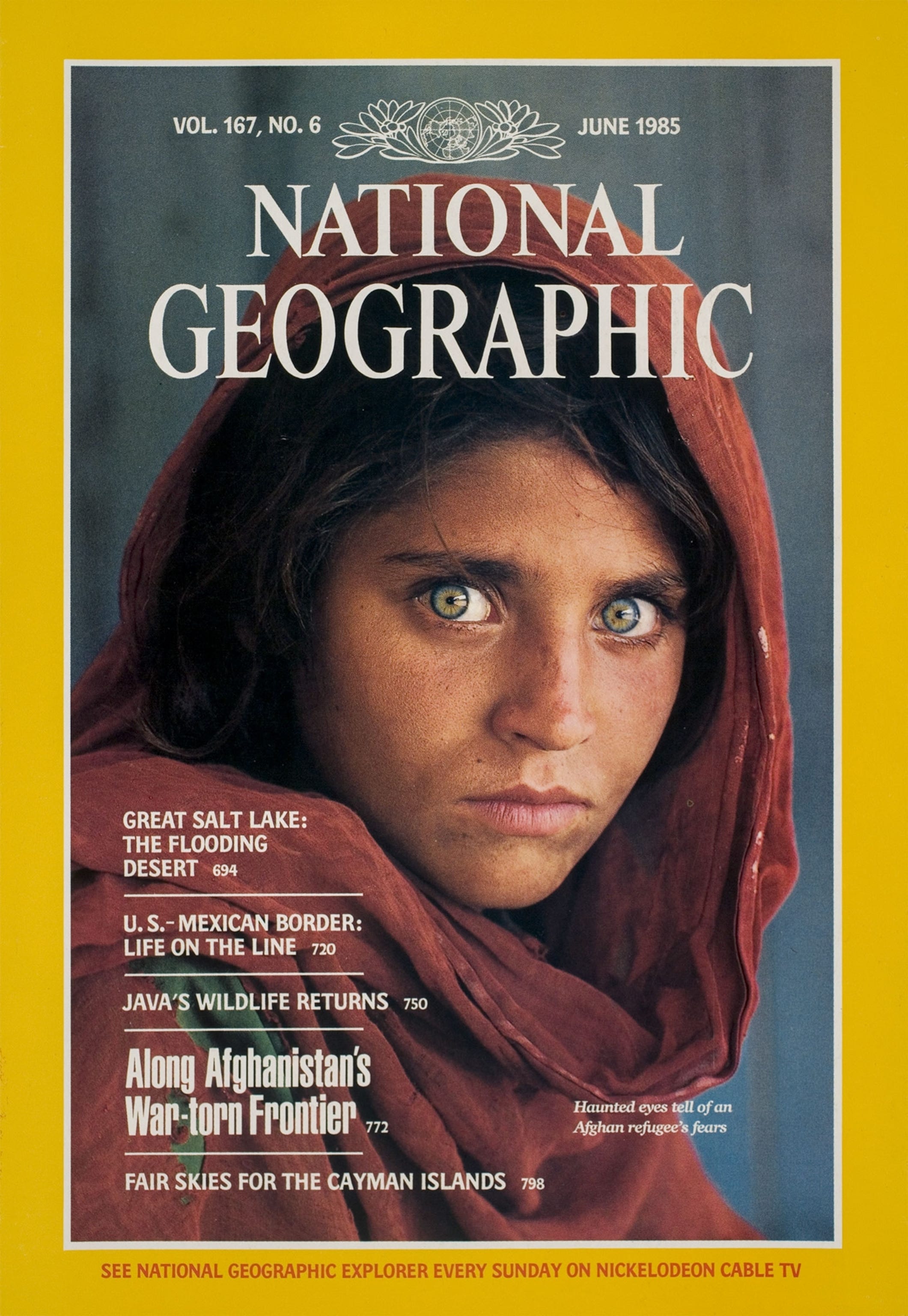
This also appears in design. When I think of the most famous magazine cover, I think of National Geographic’s 1985 cover featuring the Afghan girl photographed by Steve McCurry. While working with American publishing companies (Time Inc., USA Today etc), I was told that covers with faces sold better than covers without them. That is a personal industry anecdote, not a specific study, but it reflects an assumption that has shaped editorial design.
YouTube makes this assumption obvious as well. Go to YouTube home page and you will encounter rows of enlarged faces: surprised, angry, crying or screaming, pointing toward objects or looking directly at the viewer. Creators continuously test their thumbnails, and YouTube now provides tools for testing multiple thumbnail and title combinations while measuring which performs better. Nobody is forcing creators to use faces, yet most of them do.
There is no reliable universal rule proving that adding a face will always increase a thumbnail’s click-through rate. Performance depends on the subject, audience, expression and, of course, the clickbait title. The available research is much stronger on faces attracting visual attention than on faces guaranteeing more clicks. Still, their repeated use can’t be arbitrary. In a dense grid of competing images, a face is one of the few visual elements for which we already have an extremely developed detection system.
The same may explain something I notice in my own behavior. When I open Instagram Stories, my attention tends to move first toward circles containing faces in the preview. I am not studying each circle and making a deliberate choice. I simply notice those circles more quickly and tap on them.
Obviously none of that proves that a face is always the right design solution. Attention itself is not automatically useful. A fire alarm should demand attention, a banking interface should not make every button scream at you.
But it still creates the main contradiction I keep noticing. We possess a visual pattern that can be recognized from almost nothing, attracts attention early and carries enormous social meaning, yet when we design anything from identities to the digital products we interact with every single day, we tend to ignore it completely.
I should also acknowledge that I am writing this from the perspective of someone who grew up in Europe and spent most of his adult life in the US. In Japan, faces appear on almost everything, whether it makes sense or not: trains, airplanes, construction sites, packaging, you name it. Maybe they know something we don’t.
Inter Face
Now think about the apps and interfaces we use every day. How many contain any resemblance to a face? Any face-like representation counts, be that an app icon, a product logo, a feature icon, or a small arrangement of shapes that seems to be looking at you anywhere in the interface.
The first example that comes to mind is Finder.

Apple describes Finder as being represented by “the blue icon with the smiling face.” It is the place where Mac users access and organize all their files, images, videos and pretty much everything else stored on the computer.5 The face does not explain that function at all. Apple could have used a computer icon, magnifying glass, document or some other representation of storage and retrieval. Instead, Finder looks back at us.
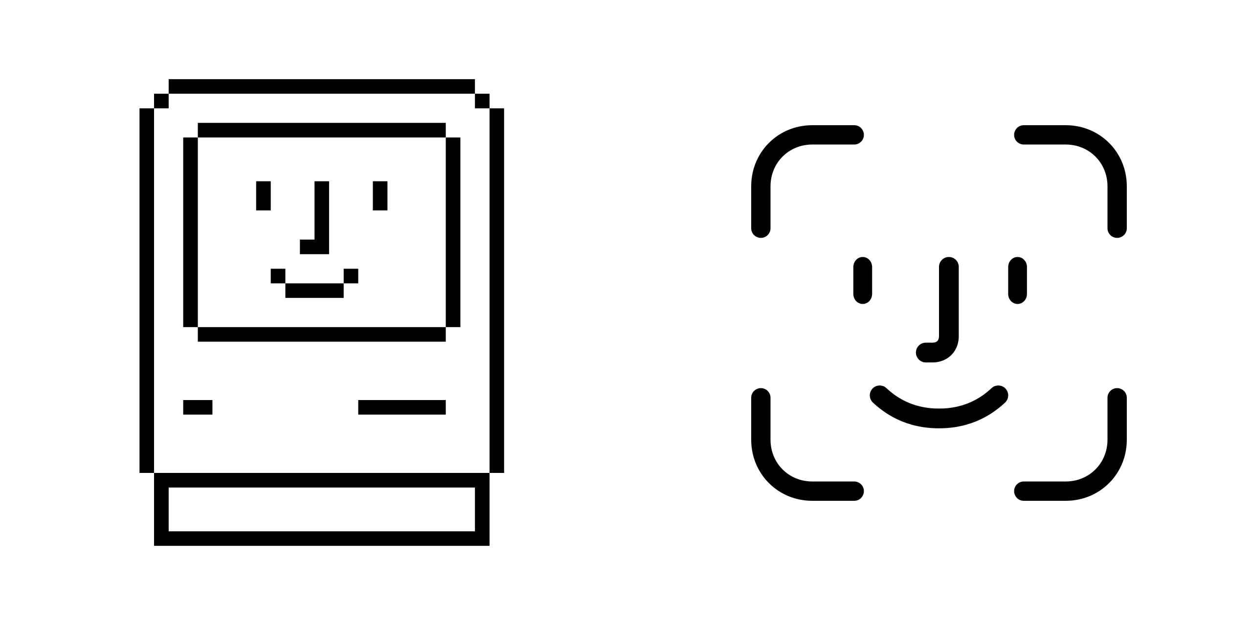
Its ancestry goes back to the visual language of the original Macintosh, introduced in the first half of the 1980s. Susan Kare’s early icons used a small pixel grid to turn abstract computer concepts into understandable visuals. The Happy Mac greeted the user with a smiling computer face, indicating that the machine had started successfully. This made the computer appear not as an abstract piece of technology, but as something that was awake, friendly, and ready.
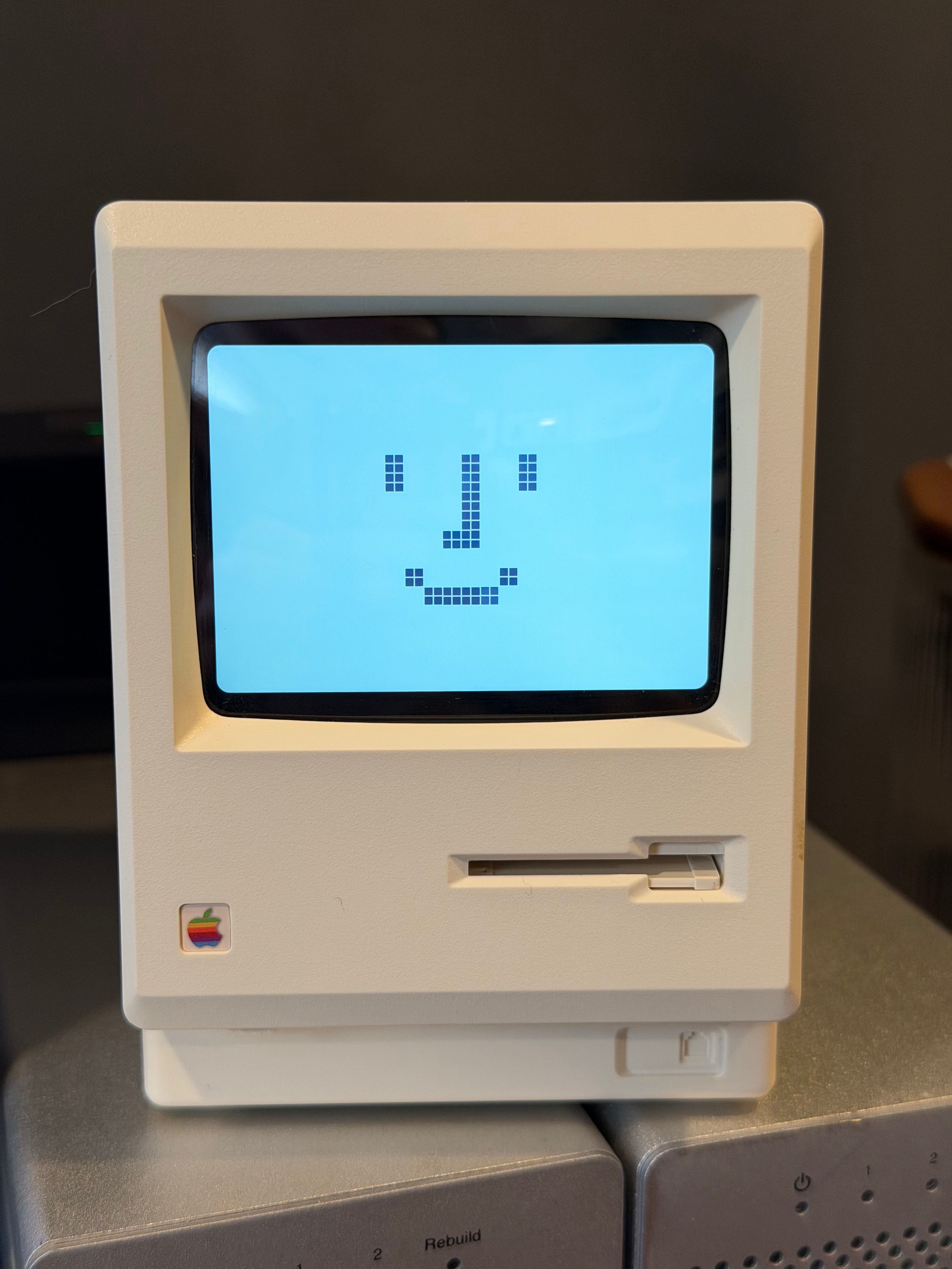
Finder remains exceptional because the face has survived while the surrounding technology has changed completely. Screen resolutions increased, interfaces gained color and at times became more abstract, but the face remained.
The smiling face even got another meaning once Face ID was introduced in 2017. Though here the face has a direct functional reason to exist. The system requires the user’s face, so a simplified face explains what is being scanned. But the design of the Face ID icon has a direct lineage to the Happy Mac icon from the 80s. The anthropomorphic symbol visualizes a complex biometric process as an immediately understandable visual instruction.
Beyond Apple, examples exist, but again they arrive slowly. Discord’s icon can be read as a game controller with a face. Reddit uses a round alien head smiling at you. Twitch uses a speech-shaped character with eyes.

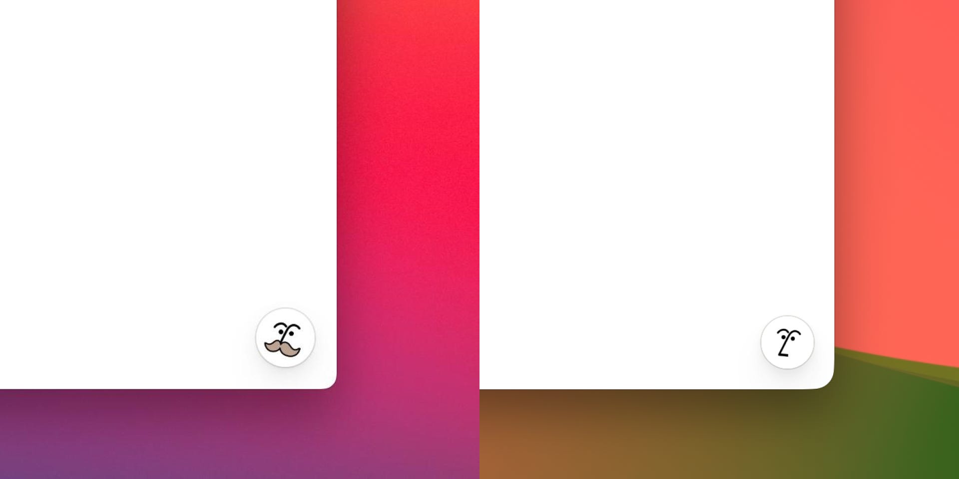
With the arrival of countless AI products, some assistants and chatbots occasionally use avatars, heads, facial expressions or eyes. Yet most still identify themselves through abstract marks. Notion AI, for example, introduced a small illustrated face for its AI feature. At first, it looked a little too much like the Pringles mustache guy, although it was later redesigned.
Emojis are the enormous exception sitting directly inside our interfaces. They show that simplified faces remain one of our most efficient forms of digital communication. A simple symbol can communicate joy, doubt, embarrassment, anger, exhaustion, disbelief or sarcasm faster than a sentence can. But emojis usually belong to the user. They help us express ourselves inside the interface. They rarely become the interface itself.
Most digital products remain environments of rectangles, lists, arrows, folders, sliders, buttons and abstract symbols. Even software designed to speak with us, recommend things to us, anticipate our needs or simulate intelligence often avoids giving itself some kind of face.
The Missing Face
If faces are one of the strongest visual patterns we recognize, why do they appear so rarely in the products and interfaces we use every day?
There’s no research that points to a single explanation. Most existing studies examine anthropomorphism in chatbots, robots, packaging or individual branding experiments. They look at what happens after human characteristics are introduced into a product. Very little research asks why contemporary interfaces and visual identities avoid faces almost entirely.
Designers may prefer abstract symbols because they feel more conventional, more flexible or more appropriate for serious products. Faces may be associated with cereal boxes, restaurants, games, entertainment and mascots, making them appear childish or insufficiently serious in some contexts.
Research on anthropomorphism does not provide a clear answer either. Some studies show increases in trust, attachment, social presence and engagement when products or interfaces become more human.6 Others suggest the opposite: anthropomorphic brands may be judged more harshly, while anthropomorphic AI systems can alter trust and how responsibility is assigned when something goes wrong.78
There is also no broad body of research comparing thousands of interfaces with some kind of anthropomorphic feature and those without, partly because there are not enough such interfaces to form a meaningful study. We can measure how people respond to an anthropomorphic chatbot or a character on a package. It is much harder to measure the effects of a design approach that most products never attempt.
Perhaps the simplest explanation is that designers inherit visual conventions from other designers. Banks resemble banks. Productivity software resembles productivity software. New products begin by looking at existing products in their category. Once a visual language becomes established, it reproduces itself. Faces remain associated with certain kinds of products, while abstract symbols dominate others.
Could it be that designers have simply accepted this convention without ever testing the alternative? I am not saying every product should suddenly grow a pair of eyes. But it does raise the question of whether we don’t use faces because they failed, or simply because we never tried.
Looking Back
Long before we learn written language, symbols or software conventions, we learn to read eyes, mouths and expressions. We understand when a face is looking at us and when it looks away. With only a few marks, we can turn an abstract shape into a social presence.
Food brands use faces to give anonymous products a source, host or personality. Publishers and advertisers place faces where they want attention. Social platforms fill our screens with faces because people are looking for other people. Emojis can communicate emotions with tiny symbols that have eyes and mouths. But most products, brands and interfaces stop just before the shape starts to look at us.
We spend our days looking into screens filled with tools that organize our lives, speak to us, make decisions, answer questions and increasingly appear to think. Perhaps that is what makes their absence so surprising.
The face may be the most familiar interface we have. 👀

Great essay @repponen
It is fascinating how some design choices might change entirely how we interact with a product or object. I think the "form follow function" maxim has it's use, but it's only part of the answer when it comes to interacting with inanimate things.
The other 50% of the equation is usually something related to an emotional response, which I wouldn't doubt these faces provoke. "Form follows emotion", is another really interesting concept that I've been giving a good amount of thought lately.
How can I incorporate function, sure, but also emotion and friendliness into things that otherwise would just be useful but not loved.
I agree. I designed a data analytics app and had an idea to visualize a complex multi-metric aggregated score using Chernoff faces for exactly the same reason. We never tested it though.