
Re:View - Vol. 5
Nothing in common except curiosity and a good excuse to keep collecting.

Another occasional sweep of things I find interesting, surprising, and worth bookmarking and coming back to. As usual, it’s all design related: from books, websites, and print ephemera to artifacts and the kinds of interfaces you find only by getting lost. From a Babylonian customer complaint to a camera that pretends to be film, from a Portuguese educator’s archive to Victorian classifieds that bend type into pictures. Enjoy. 🍬
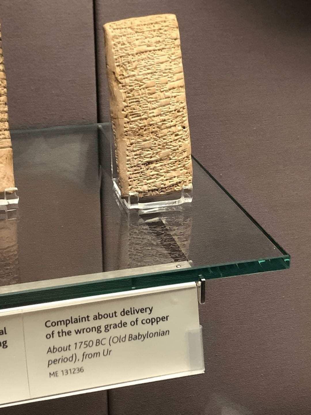
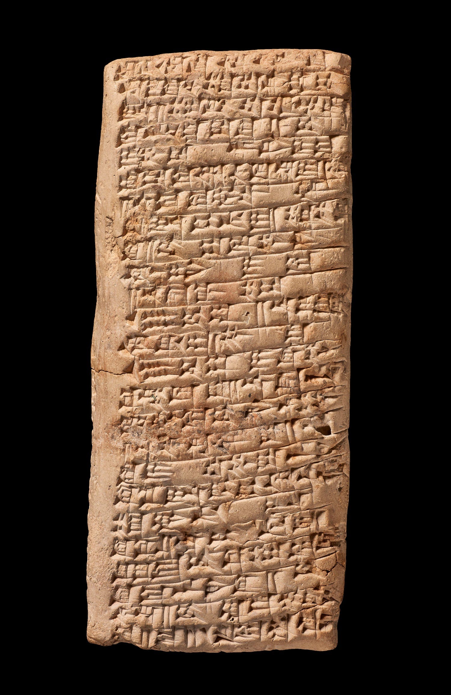
An early “May I talk to a manager”.
The oldest known customer complaint is a clay tablet from c. 1750 BCE (Old Babylonian). A buyer named Nanni wrote to the copper merchant Ea-nāṣir being unhappy with the copper he received and worse service. It’s in cuneiform script but reads like an email. The tablet currently housed at the British Museum.
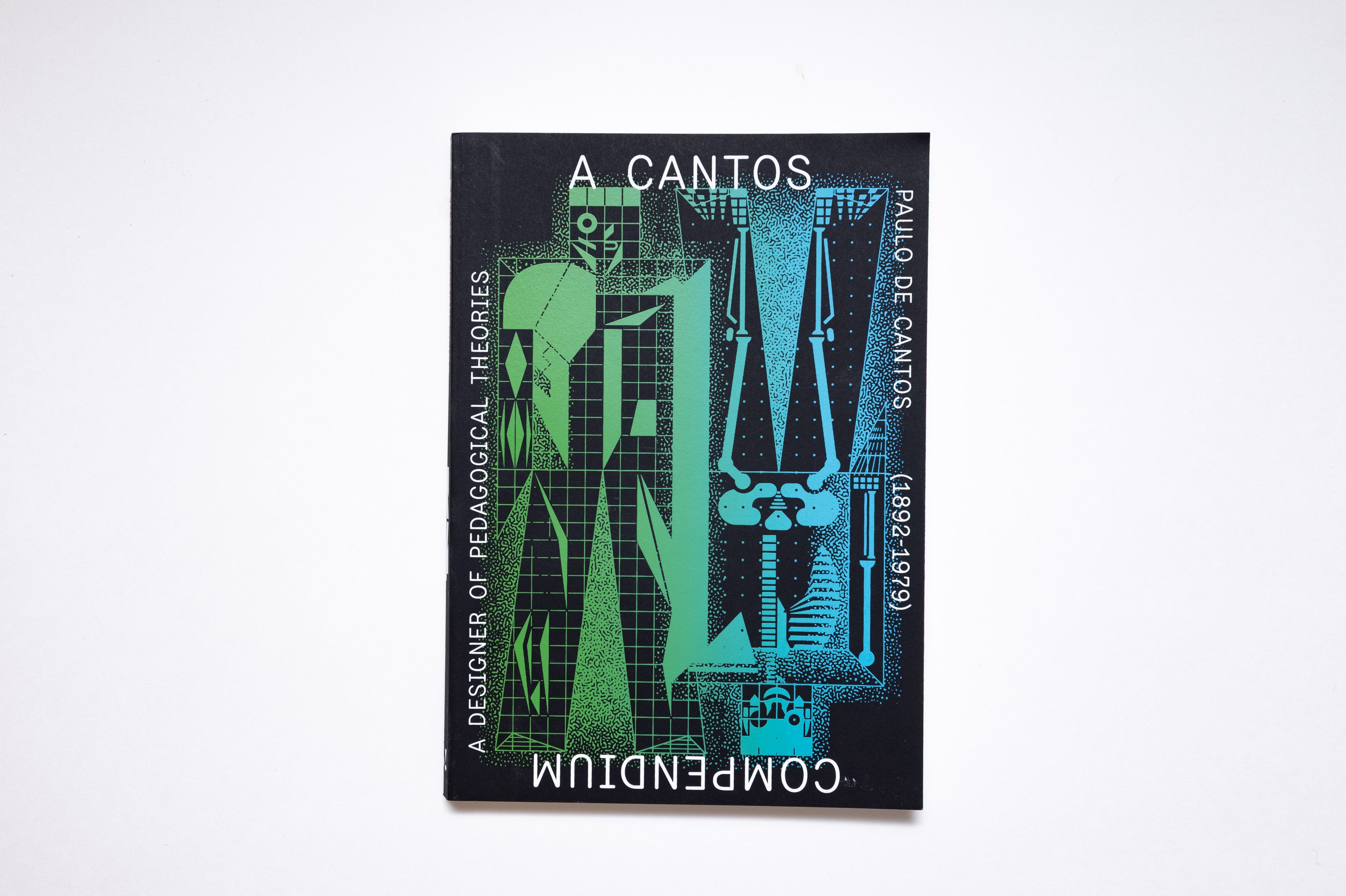
Paulo de Cantos: A Cantos Compendium
Paulo de Cantos (1892–1979) was a Portuguese publisher, educator, and graphic designer known for his innovative approach to book design and printing. His work, often self-published, was highly experimental and forward-thinking in terms of blending typography and avant-garde layouts. The book, that was released in 2023, contains 4 essays that expand on the life and work of Cantos in the context of Portuguese and European design and pedagogy, followed by visual essays of his work.
What’s super nice is that in addition to the printed volume there’s an online archive at cantosverso.org that serves as a digital repository of Cantos’ publications and work.
Paulo de Cantos: A Cantos Compendium
Published by Barbara Says… , 2023
ISBN: 9789893332566


Malaproject.com
I’ve been saying for years that many businesses, restaurants included, no longer need a website. As long as they’re listed on local social platforms, food reservation and delivery apps, and Google Maps, there’s little reason to invest in one. When was the last time any of us saw or designed a dedicated restaurant website?
Until you stumble upon a gem like malaproject.com by Jingqi Fan, and suddenly, I am proven wrong. The entire vibe of this Brooklyn-based Chinese restaurant’s website is just too good! The abstract homepage video syncs perfectly with sound (!), the copywriting mimics the aesthetics of subtitles, and the art direction of the photography is absolutely stunning. The web can still be beautiful and this website is a proof.
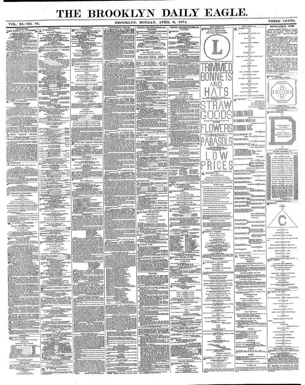
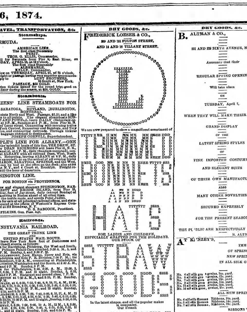
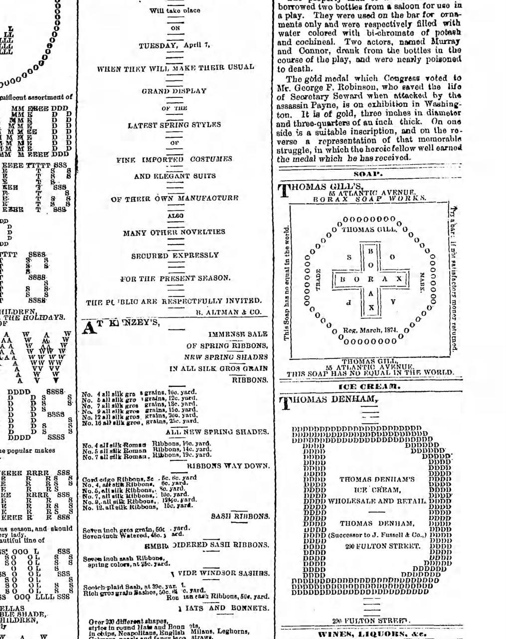
Creativity under constraints, 1874.
A scanned page from The Brooklyn Daily Eagle, Monday, April 6, 1874. What fascinates me is how advertisers tried to stand out inside a sea of small-type text with almost no tools. In the upper-right you get “Trimmed Bonnets & Hats” (among many others), composed in the same type as the rest of the paper, but arranged into shapes and letter puzzles that read louder than any headline. No color, no new fonts, barely any scale, just layout doing the work. A nice lesson in being inventive when the constraints are absolute.
Size matters
In Japan, food packaging images cannot mislead about what’s inside. The Consumer Affairs Agency enforces the act against Misleading Representations, which forbids photos or layouts that create an overall impression of better quality, quantity, or appearance than the product actually delivers. The Food Labeling Act also requires “proper” labeling that helps consumers make informed choices.
That is why snack makers tend to keep images close to reality, sometimes adding “actual size” or “image is for illustration” notes. There is no rule that every candy photo must match the item exactly, but images that materially overstate size, shape, or amount can be treated as misleading under the advertising law.
Here’s a quick video I once came across on Reddit that illustrates this design treatment.
Recapture the joy
Pretty interesting attempt to recapture the joy and meaning of analogue photography with a digital camera. Yashica, a Japanese camera brand, introduced the Y35, a manual-style digital camera. Side note: The relationship to the original Yashica company is a bit muddy for this product.
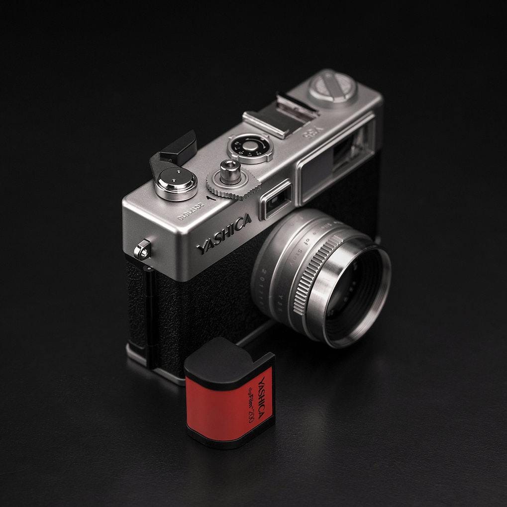
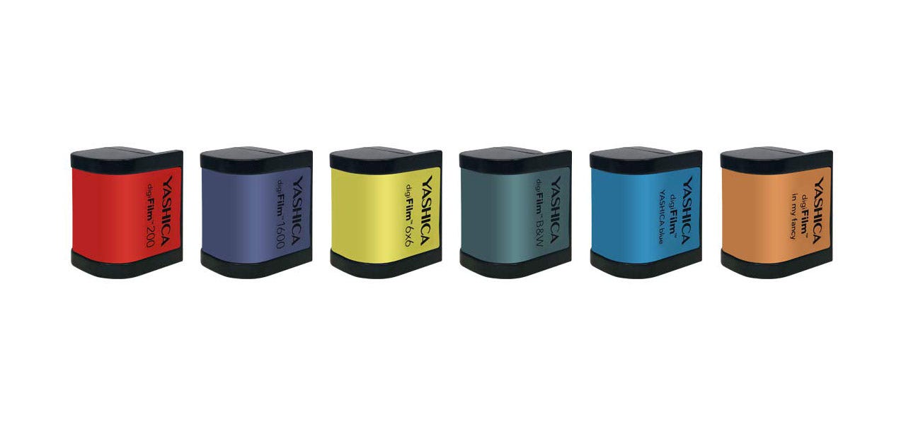
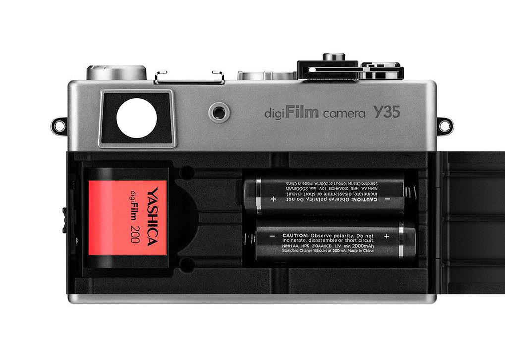
The camera looks and behaves like a fully manual film body. Instead of regular film, you load a hardware cartridge that looks like a 35mm roll, called “digiFilm.” Each cartridge sets its own color treatment and an ISO, similar to choosing 200 or 400 speed film, and some cartridges also change the aspect ratio.
Staying true to the film metaphor, you have to wind the lever after every shot. There is no rear screen to preview photos, which means no deleting, or as Yashica puts it, “no hiding from mistakes.”
Here is the strange part. If you follow the metaphor closely, you would expect files to save onto the digiFilm itself, maybe with a fixed number of exposures (for example 36 photos per cartridge). Instead, images are written to a separate SD card that has nothing to do with the cartridge you inserted.
In practice you end up carrying the camera plus a handful of digiFilm cartridges to swap styles and ISO. The experience might feel clunky and a little cumbersome, but I appreciate the attempt to make digital more tactile.
After watching several YouTube reviews, I got the impression that the image quality is terrible and the camera itself feels very poorly built. But again, I find it fascinating purely from an interaction standpoint.
This gentleman subscribed to this publication from every single screen he has. Just FYI.
Hi, I found your video on Youtube and it led me here. I read all of your blogs. I just wanted to reach out and say thank you for sharing your journey. I’m currently in a phase of rediscovering my love for design after leaving a role that took a lot of my energy, and your sharing feels like a genuine reminder of why we do this in the first place. There’s a sincerity in your perspective that really resonates with me and has helped bring back my spark for the craft. Thank you for being so open. It’s making my own exploration feel a lot more meaningful. :)