
Re:View - Vol. 4
Because the algorithm won’t show you this stuff.

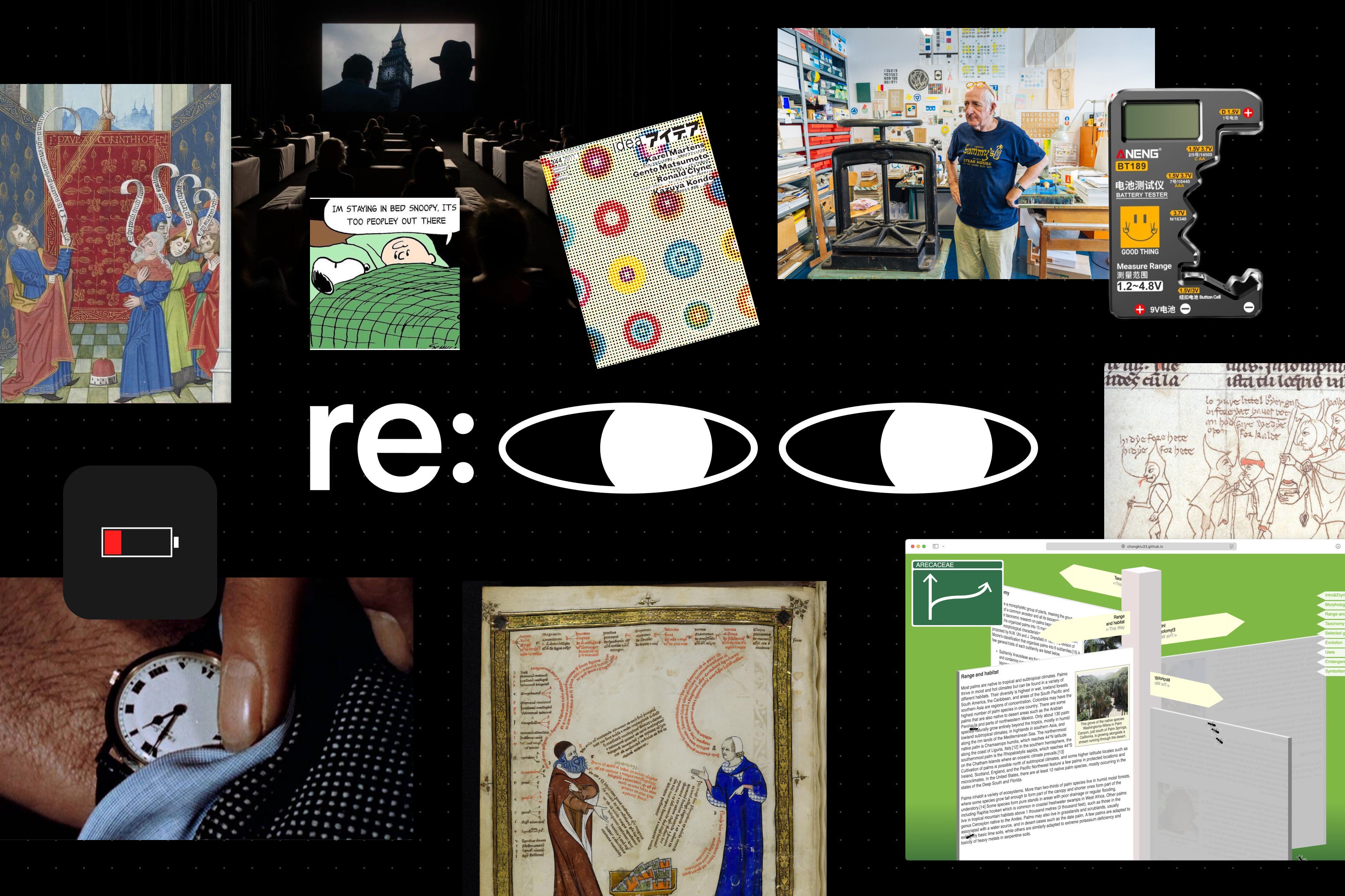
What do medieval chat bubbles, a 24-hour movie, and a battery capacity tester have in common? Exactly nothing. Except that they all found a way into this issue of Re:View.
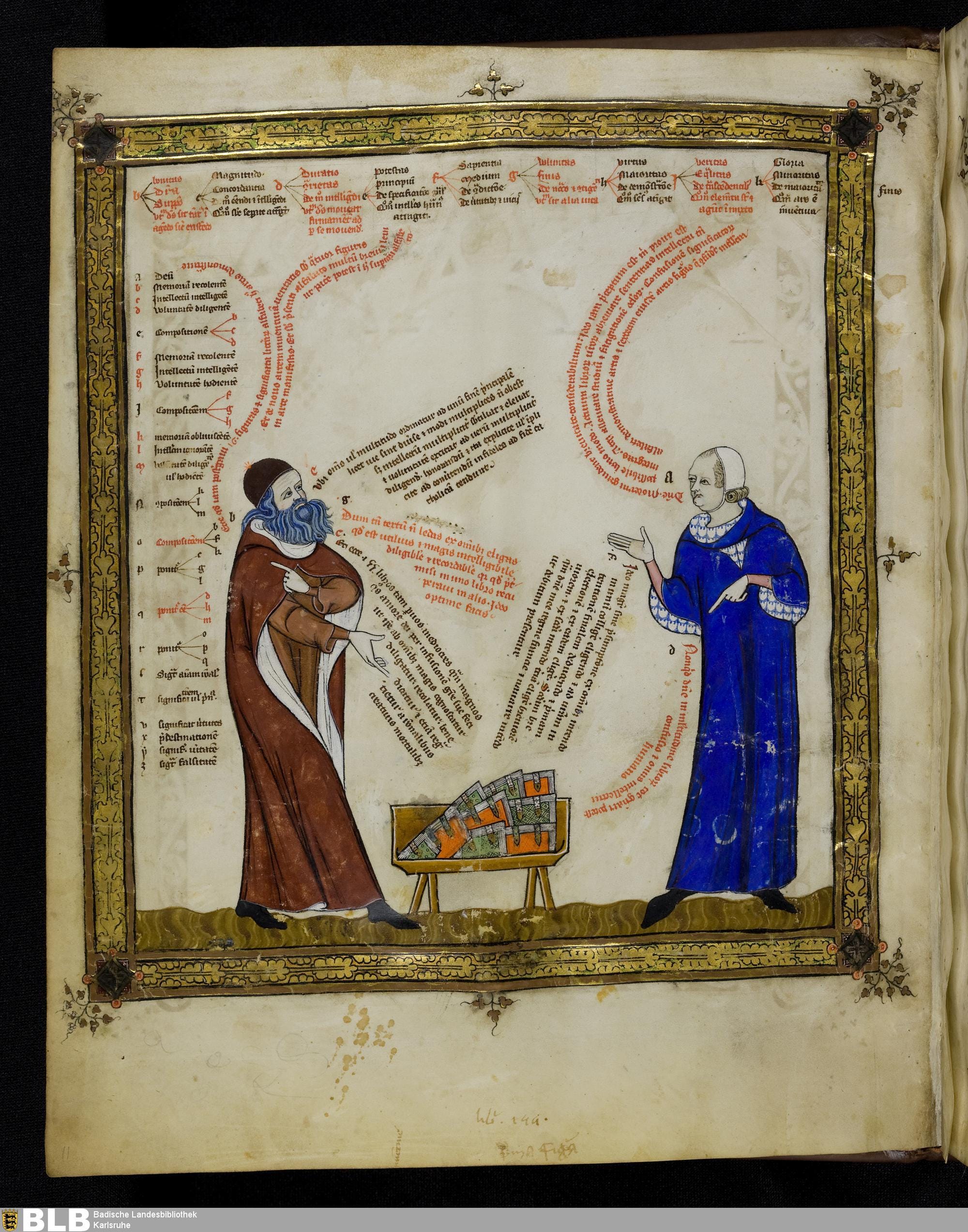
Medieval Speech Bubbles
This was totally new information to me. The concept of speech bubbles, as the way to visualize conversation (like in comics or manga) dates back to the 1300s.
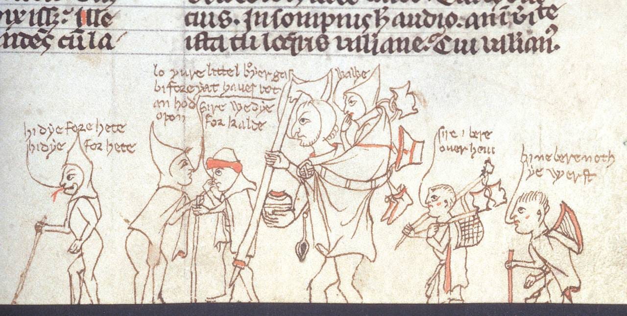
This medieval illustration depicts a group of travelers conversing in English. Though not quite the speech bubbles we know today, the visual representation of dialogue was already in use.
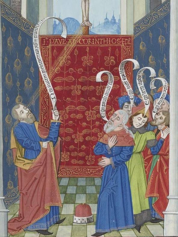
Before printed books, scribes used banderoles—scroll-like ribbons that allowed figures on the page to “speak.” These decorative banners often flowed from a character’s mouth, creating a strikingly modern effect, much like today’s speech bubbles.
In some manuscripts, direct speech was written floating in mid-air, completely unsupported by a banderole or bubble. Scribes carefully positioned the text so it appeared to flow from the speaker’s mouth, an early take on visualized dialogue.
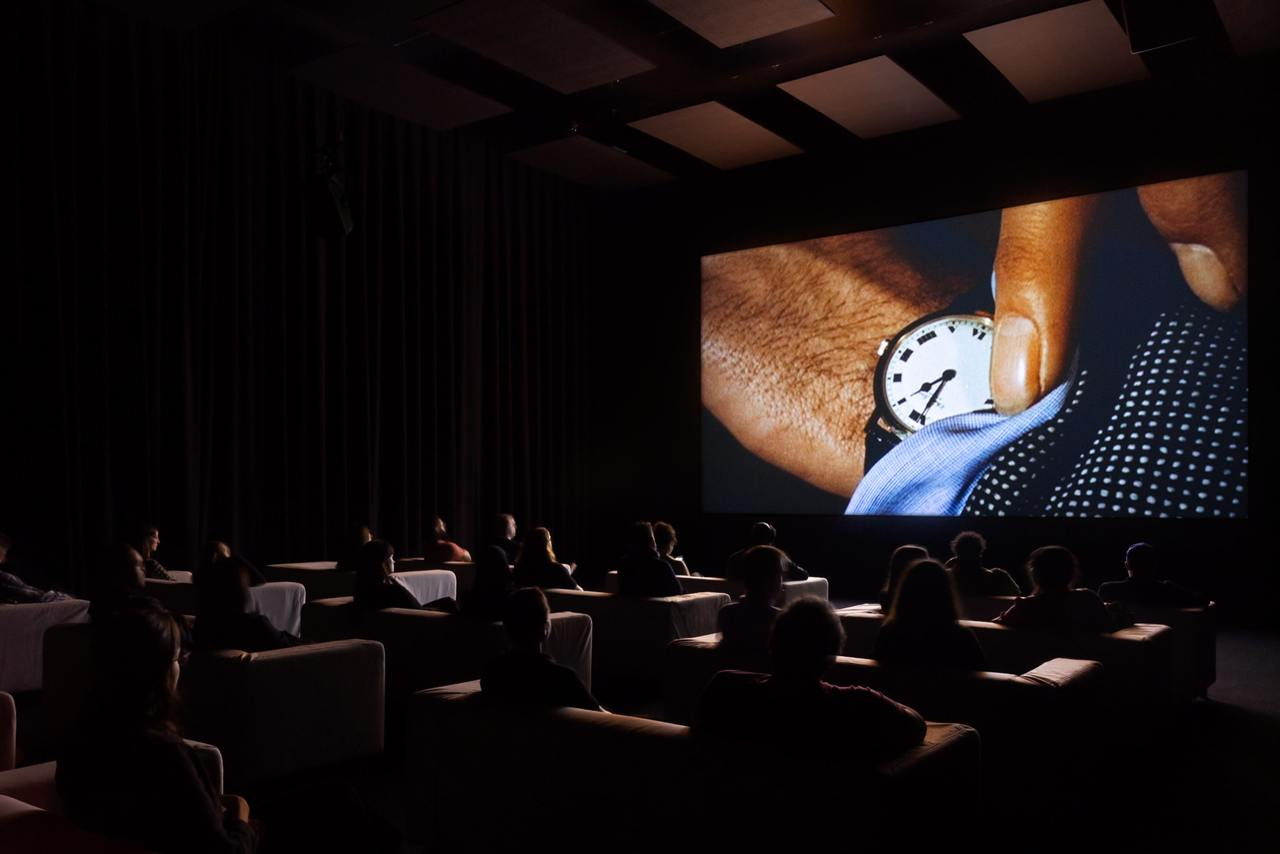
The Clock (2010)
I'm obsessed with the topic of Time, and what I saw earlier this year at MoMA completely blew my mind. 🤯
There was an installation on view called The Clock (2010) by Christian Marclay. The installation is a 24-hour film, an insane montage composed of thousands of movies and television clips only referencing clocks and other references to time. James Bond checks his watch at 12:20 a.m.; Meryl Streep turns off an alarm clock at 6:30 a.m.; a pocket watch ticks at 11:53 a.m. as the Titanic departs.
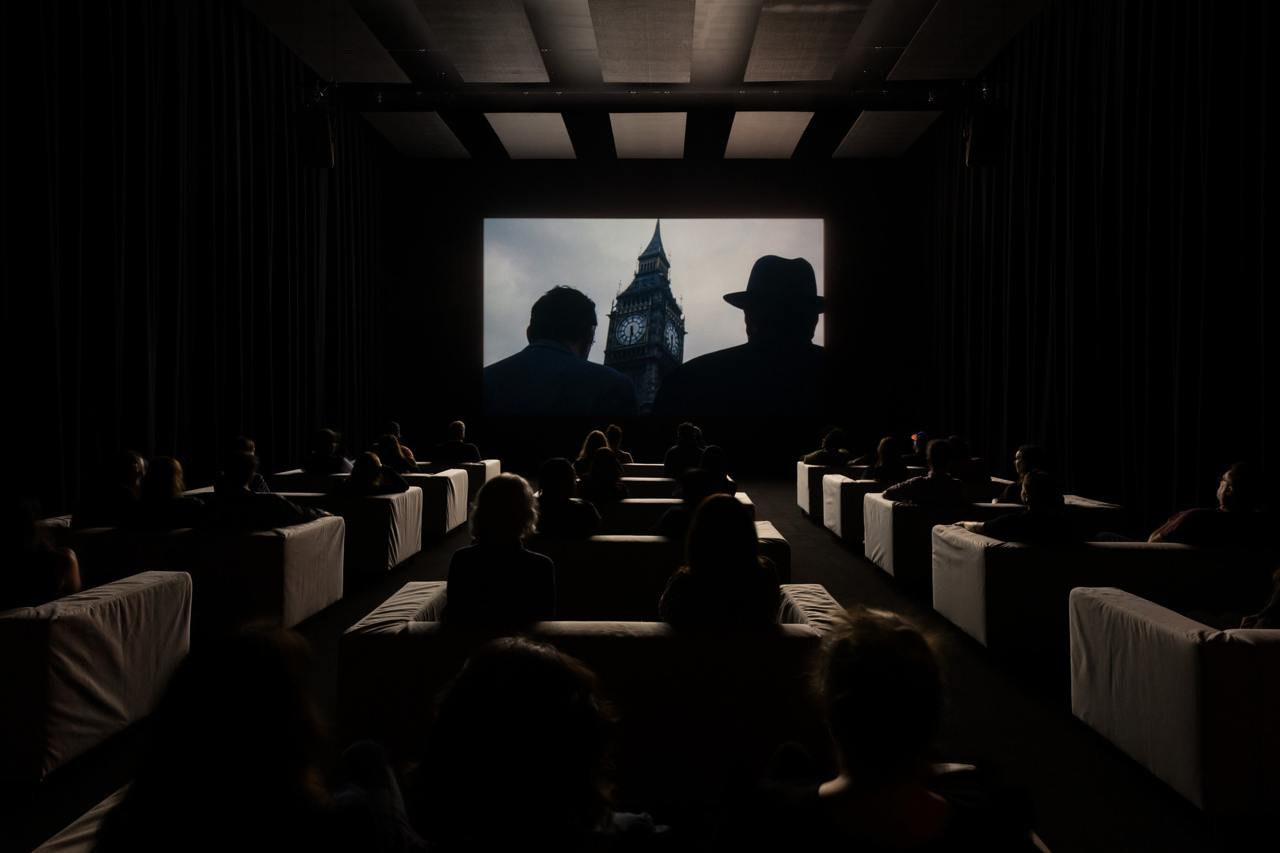
The artist meticulously sifted through vast amounts of footage to find precise time references across the full 24-hour cycle. Yet the timepieces aren’t shown continuously for a full minute; between them, other scenes and film clips are intercut, weaving a loose narrative.
What surprised me most was that the film syncs with local time. When I entered the dark screening room at 5:05 PM, the film was showing all the scenes referencing exactly 5:05 PM. This made me wonder how I could watch segments from nighttime hours, since the museum is clearly closed. Well, we can only rely on this article by someone who spent 24 hours watching the entire film.
There are a few videos on YouTube from museums and institutions that have shown The Clock over the years, along with some sneaky phone recordings from visitors. While it’s not the same as seeing it in person, they give a good sense of what the piece is like.
IDEA Issue 344: Karel Martens
IDEA Issue 344: Karel Martens Seibundo Shinkosha Publishing, Jan. 2011
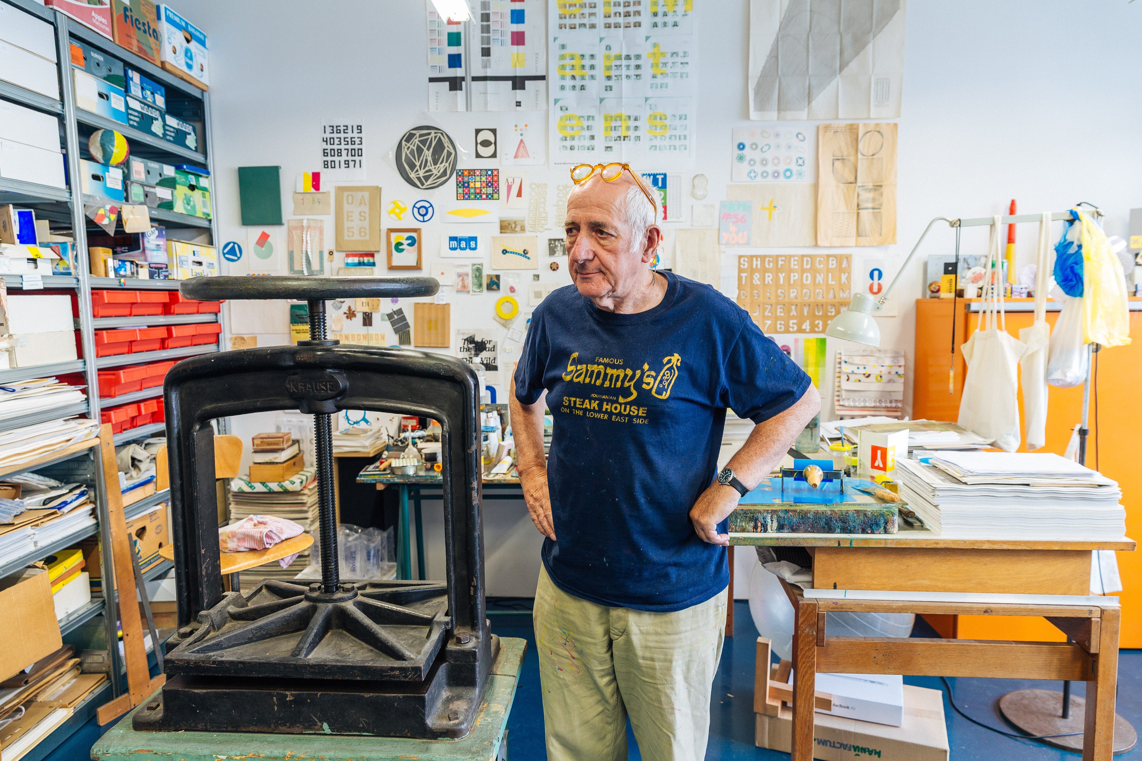
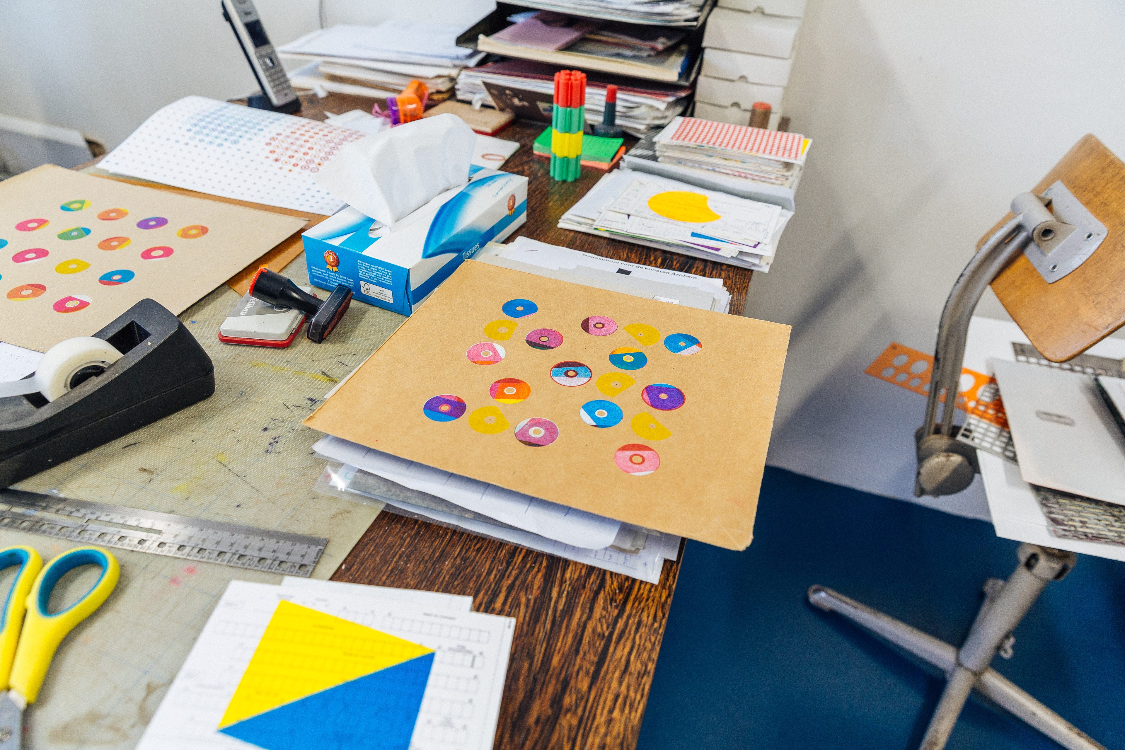
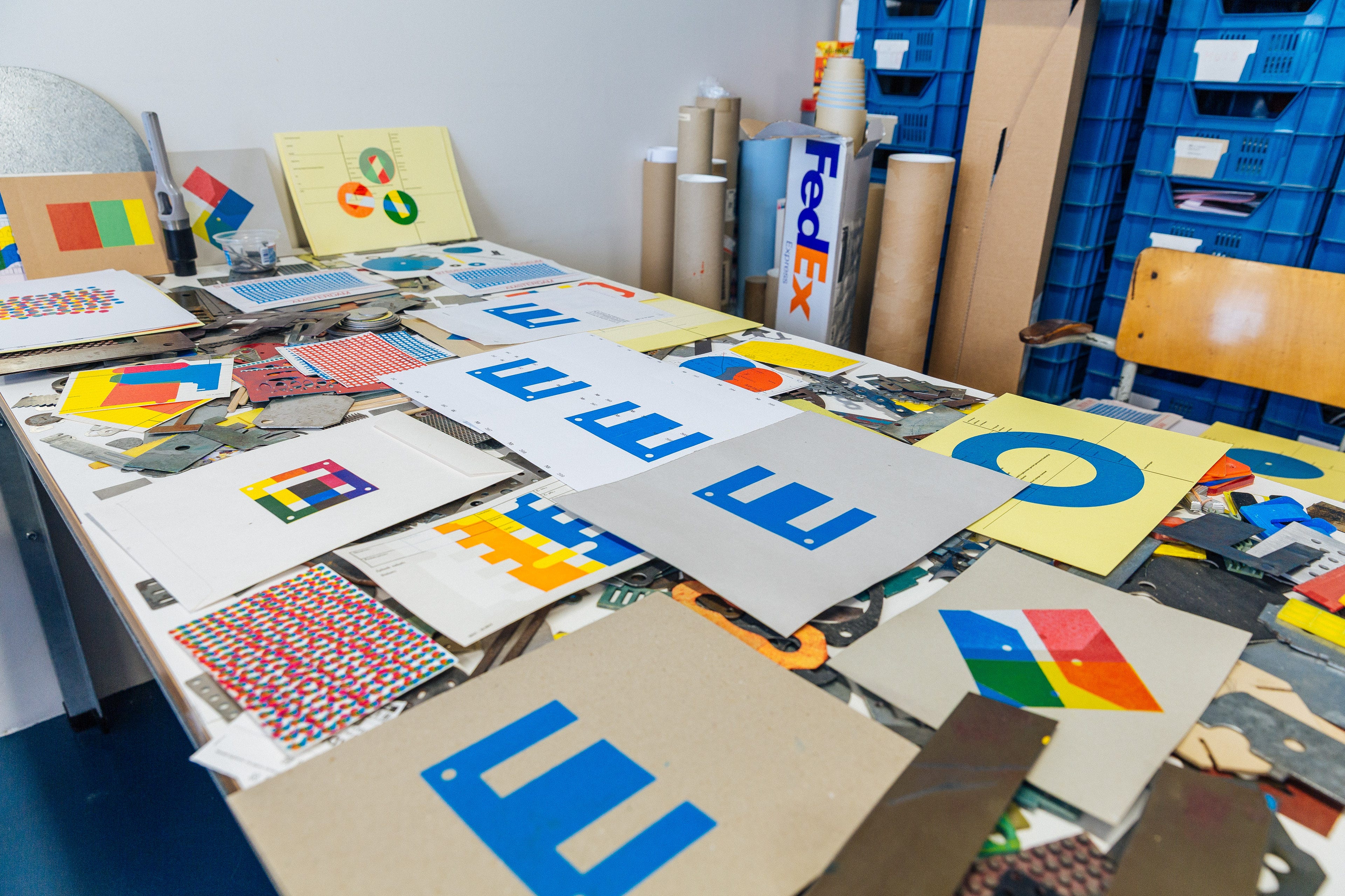
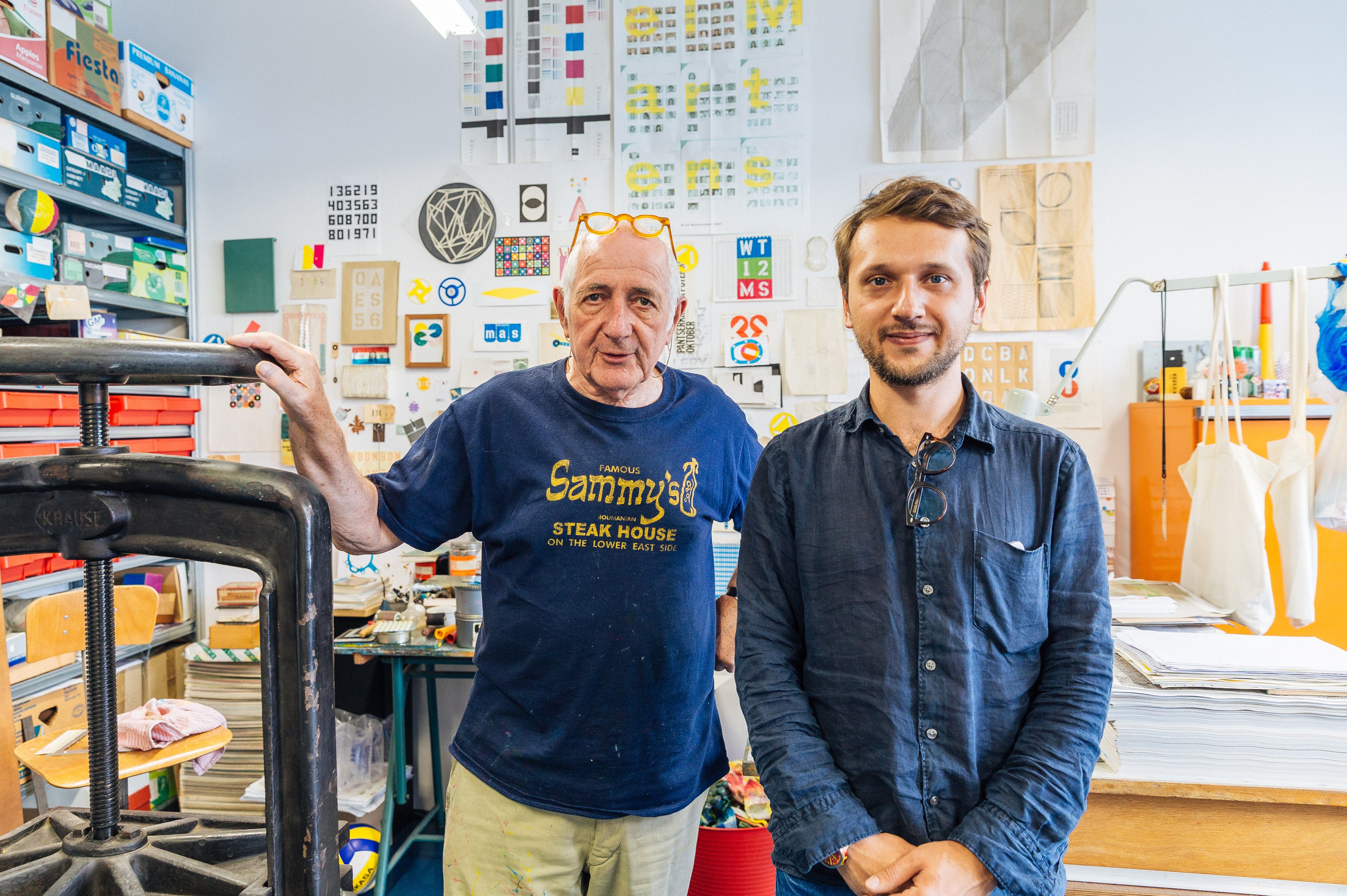
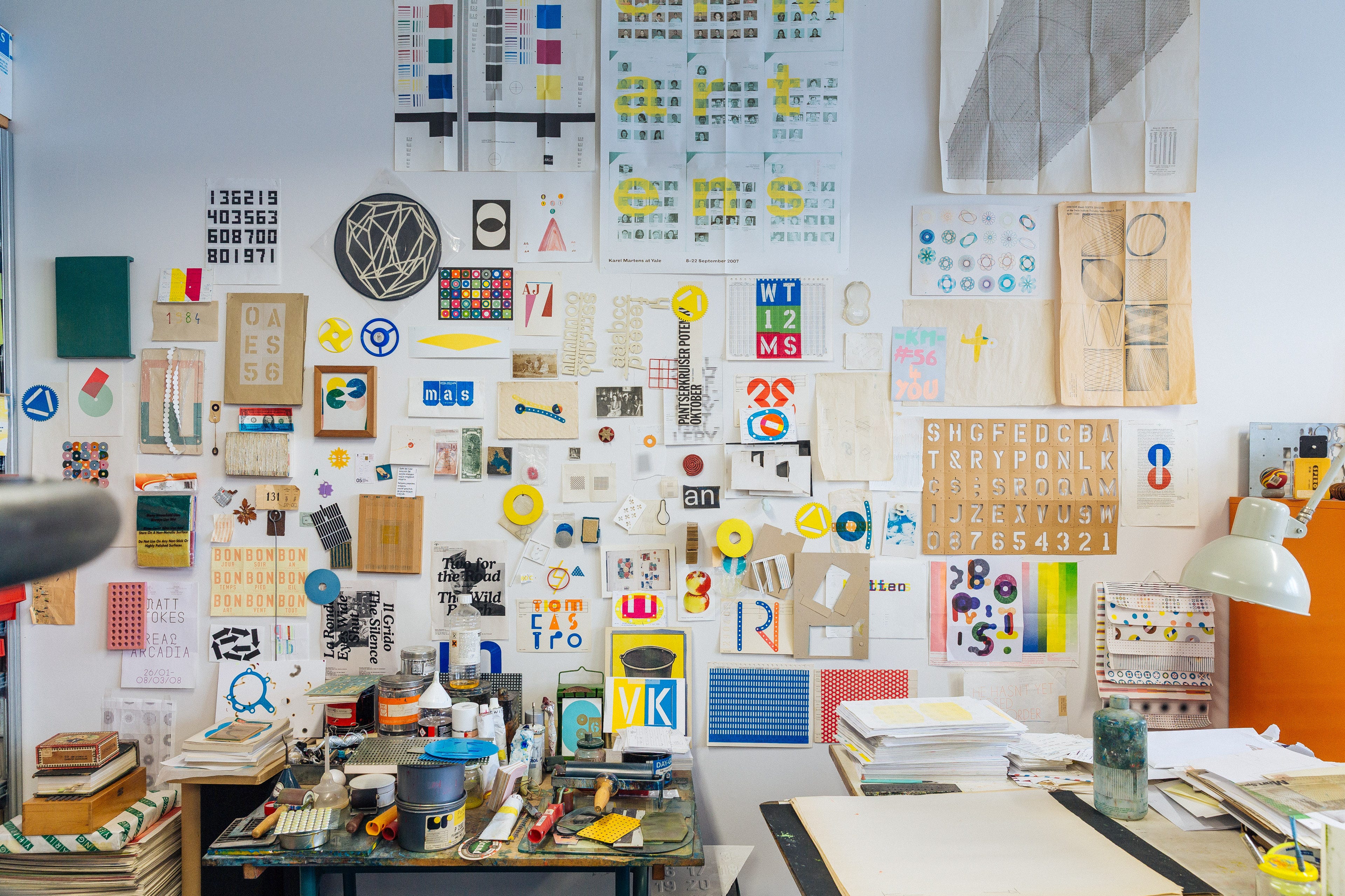
I’ve been a longtime admirer of Karel Martens, so much so that I even had the chance to visit his studio in Amsterdam back in 2017. Over the years, I’ve collected almost every book he’s ever published.
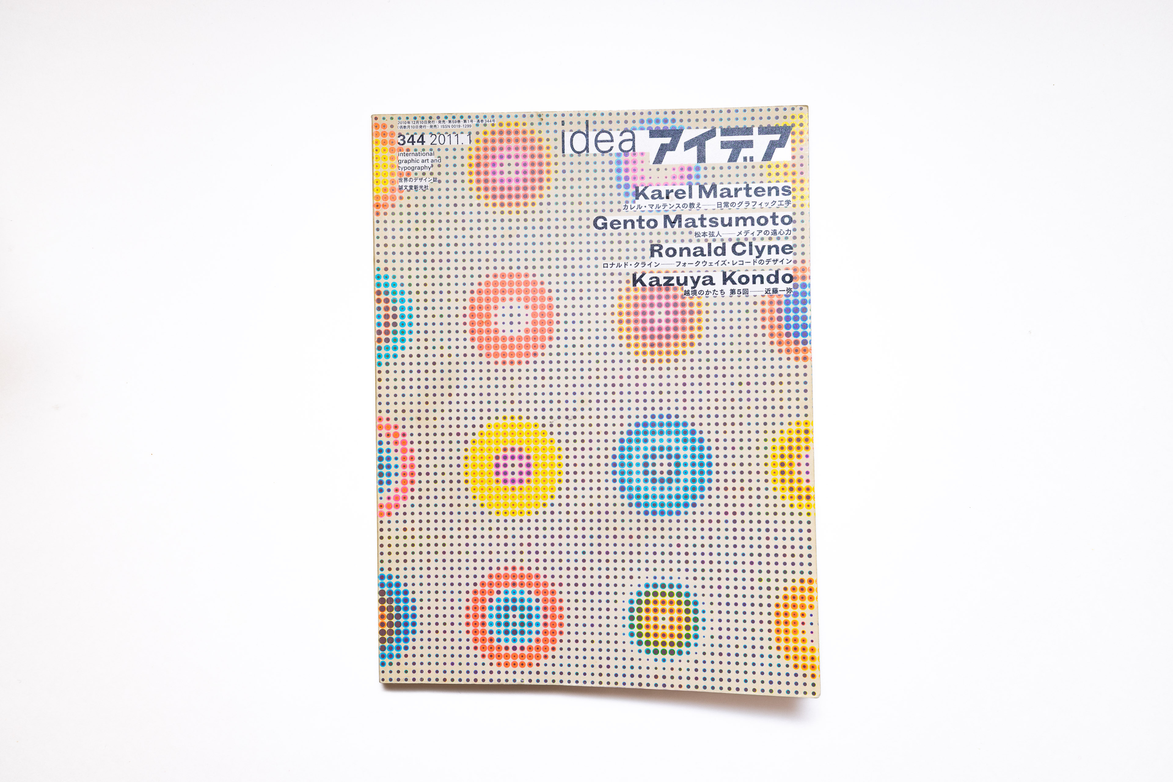
That includes this special issue of IDEA Magazine (Issue 344), dedicated to Martens’ work. I remember picking it up back in 2011 at a Japanese bookstore in Dumbo, one that, unfortunately, has long since disappeared.


As I was taking photos of the magazine, I also dug up some photos from my visit to Karel Martens’ studio in Amsterdam back in 2017.
Arecaceae
An experimental site in every sense, created by Xingshan He, is dedicated to the Arecaceae family, commonly known as palm trees 🌴. While I’m not particularly interested in palm trees, the interactive experience, where different sections of the article appear as signs on a pole, is quite fun. See for yourself.
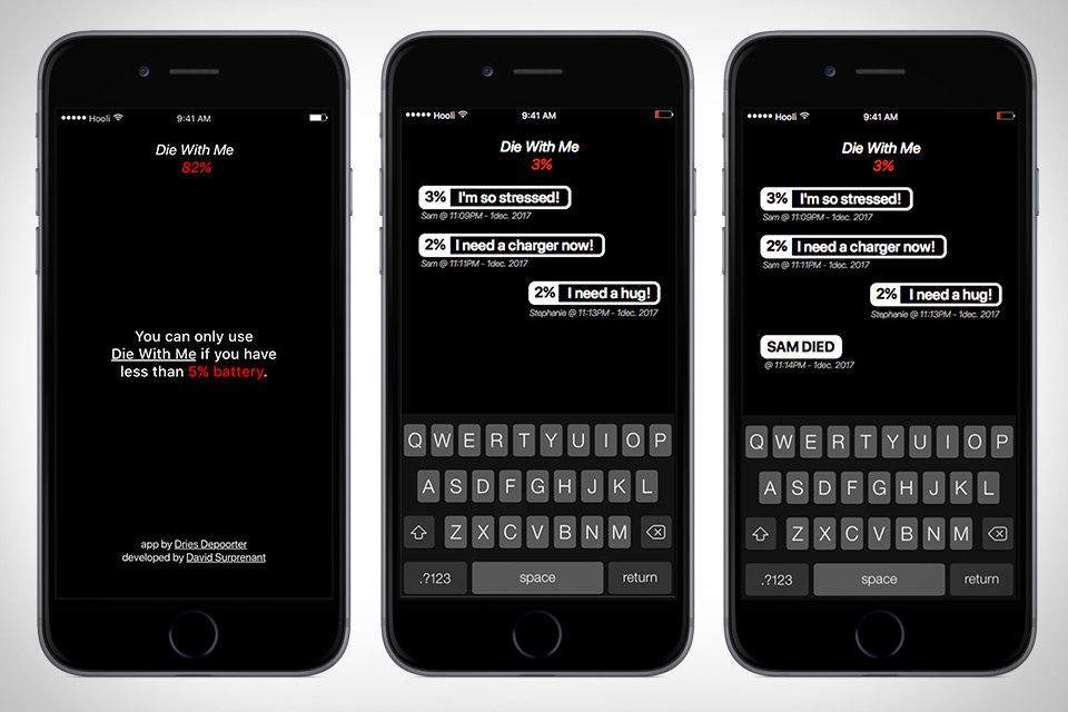
Die With Me
Another update from the corners of the internet. I just learned about an app that only works when your phone battery is below 🪫 5%. It’s called Die with Me and built by Dries Depoorter & David Surprenant. It opens up a chatroom with random strangers whose phones are about to die too, because nothing brings people together like the shared misery of impending shutdown. Think of it as a digital support group for the battery-drained, where you can exchange your final thoughts before your screen goes dark.
A Hidden World of Stationary Design
While browsing Are.na I came across an image of a strange device. I assumed it was a concept piece in the best traditions of current design trends, but it turned out to be a real tool for checking battery capacity. An example of form driven directly by function (see Form (Un)follows Function). I couldn’t find the original designer, but these devices are easy to find on Amazon.


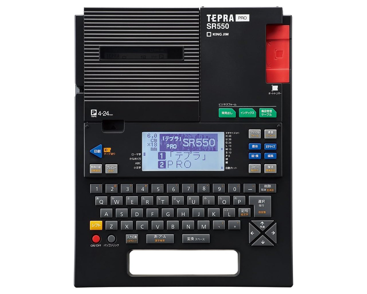
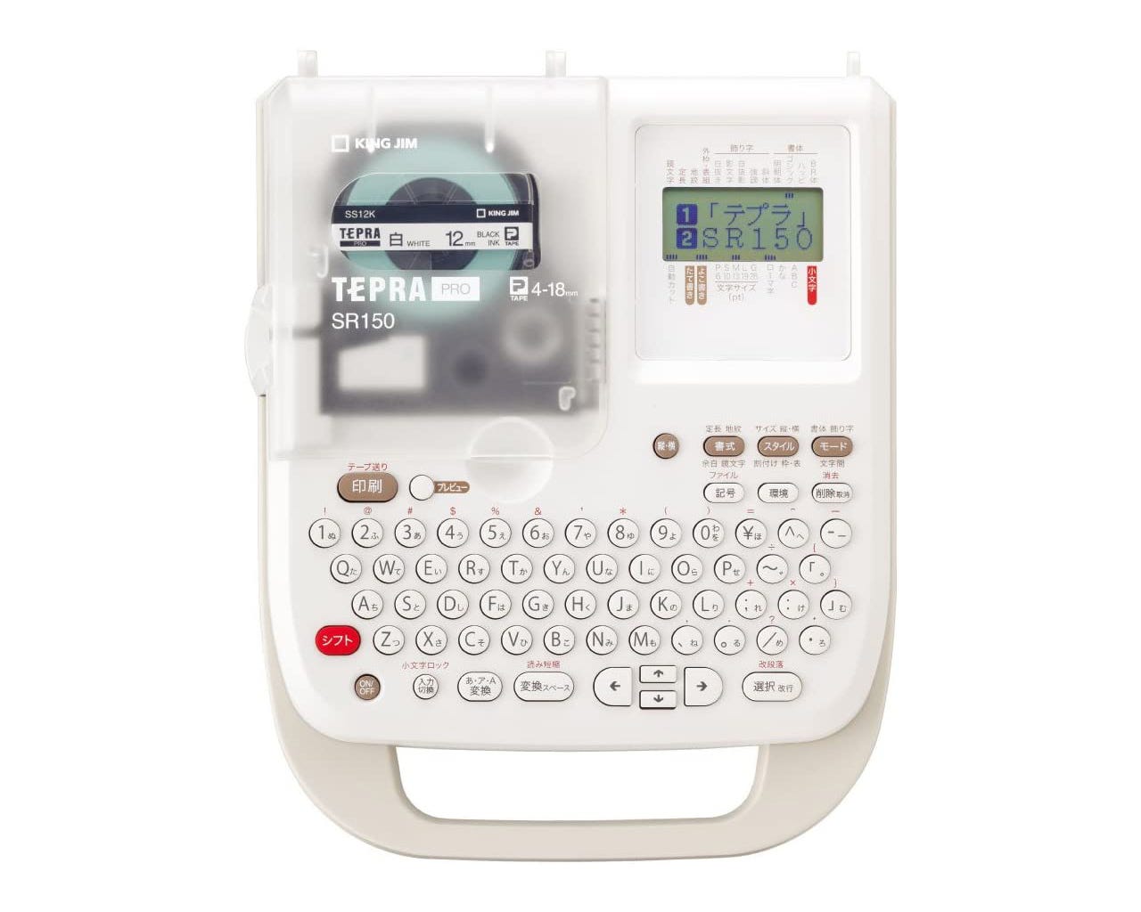
From there I went down the rabbit hole. Who would have thought there’s great design happening in the world of stationery. Designers all have the same cliché desk items (you know the ones), but I’ve never seen anyone showing off a label printer.
Look at these two TEPRA Pro label printers from a Japanese company called King Jim, which has been around since 1927. They look like something Teenage Engineering could have designed. Both have the vibe of products from the ’80s or ’90s, but no, these are relatively new models. The SR550 (the black one) costs $291.
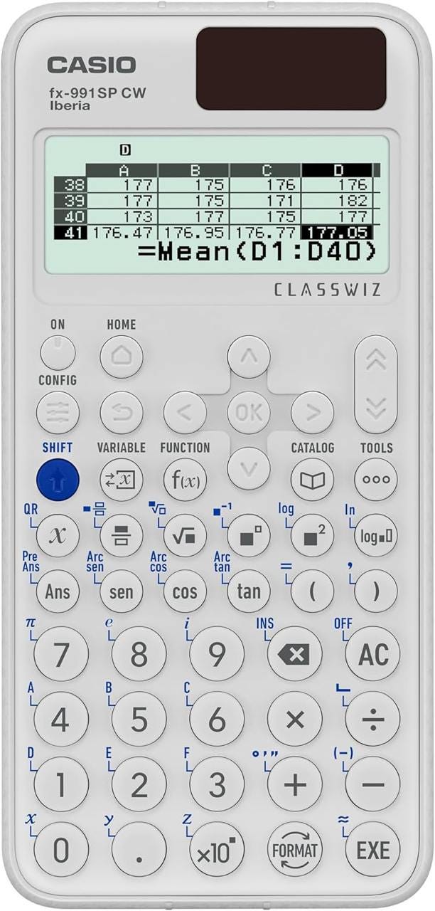
And lastly, look at this beautiful CASIO scientific calculator (fx-991SP CW). When I saw it, I thought it had to be old; after all, people use smartphones for these kinds of tasks now, right? But when I checked the Casio website, I was surprised to find that it’s relatively new, and Casio currently offers 62 🤯 different scientific calculators. Clearly there’s still strong demand for these devices. And I’m happy they still look this good.

Thoroughly enjoyed this post! I keep thinking about the phone app, so clever.